Creating Energy Hue Maps
CIAO 4.16 Science Threads
Overview
Synopsis:
In this thread we introduce a different technique to create color coded images. Many users will be familiar with the traditional three-color or tri-color image technique where three independent images are used for separate colors: red, green, and blue. Usually these image are for different energy bands and the images combined provide a visual representation of the relative contribution of each band to the total intensity of the object.
The technique demonstrated here uses two images: one image that represents the image intensity/brightness and a second image that represents the median energy in each pixel. The median energy is used to assign the color hue (going from red to purple [by default]) and is combined with image intensity to create an image in the Hue-Saturation-Value (HSV) or Hue-Lightness-Saturation (HLS) color system.
Purpose:
We can use this technique when we want to illustrate the continuous spatial-spectral variation in an object rather than binning the spectral information into energy bands.
Related Links:
- True Color Images thread
- True Color Images in ds9 thread
- Create a Color Spectrum thread
- Creating mean energy maps (aka pseudo temperature maps) thread
Last Update: 09 Jan 2024 - First publication of this thread.
Contents
- Introduction
- Getting Started
- Create Energy Hue Map
- Traditional Tri-Color Image
- Using colorsys=hls
- Summary
- History
-
Images
- Figure 1: Adaptively smoothed broad band counts image of PSR B1508-58
- Figure 2: Adaptively smoothed broad band exposure corrected counts image of PSR B1508-58
- Figure 3: Map file with a minimum of 25 counts per bin
- Figure 4: Median Energy Map
- Figure 5: SAOImage ds9 prism display of median energy histogram
- Figure 6: Plot of histogram of median energy map pixel values
- Figure 7: Plot of histogram of normalized counts image pixel values
- Figure 8: Energy Hue Map
- Figure 9: Energy Hue Map created with smoothed median energy map
- Figure 10: Tri-color image of PSR B1509-58 using CSC energy bands
- Figure 11: Centroid map for region around RCW 103
- Figure 12: Energy Hue Map of RCW 103 using colorsys=hls
Introduction
Traditional tri-color (or sometimes called three-color) images are created by combining images of the same object usually in three separate energy bands. Each image is mapped to one of the primary colors in the RGB color model : red, green, and blue; where red is assigned the lowest energy, green to the medium energy, and blue to the highest energy. The pixel value at each image is combined into a RBG value which can then be directly displayed. Secondary colors: yellow, cyan, and magenta are then a by-product of visualizing a pixel containing varying ratios of red, green, and blue intentisities. This technique lends itself very well to situations where the data are inherently separated in energy such as when working with data from different wavelengths, for example making a 3-color image from optical, radio, and x-ray data. It has also been extensively used with X-ray data where the user selects three, usually independent, energy bands. Techniques such as those discussed by Lupton, et al. have been used to improve the output.
The energy_hue_map technique discussed in this thread takes a different approach. Within the x-ray band, the energy values vary continuously. The goal of this technique then is to capture that continuous variation explicitly in the color hue. This is done by working in the HSV or HLS color space. Two images are supplied: one whose pixel values represent the energy at each location, and a second whose pixel values represent the intensity/brightness in each pixel. The energy image is used to compute the color hue and intensity image is used to compute the combined saturation and value values (or lightness and saturation values if using HLS color system).
This technique has some interesting advantages over the tri-color method. Consider an optical ROYGBIV spectrum where violet is the highest energy. In the tri-color model, the only way to obtain the color violet is to have strong signal in the red and blue (low and high) energy bands without having a strong signal in the green (medium) band. This is not very common from an astronomical source (depending on the band definitions). However, in the HSV color model, the color violet has a hue of 0.833 that can be mapped directly to the highest energy.
In an interesting twist, due to existing display limitations the images created in the HSV or HLS color space need to be converted to RGB to be displayed. A full discussion of color systems and limitations when converting between them and how they interact with human visual perception is beyond the scope of this thread; there are many online resources for those that want to explore these topics in depth.
Getting Started
In this thread we will looking at the spatial+spectral distribution of the pulsar wind nebula PSR B1509-58 data in OBS_ID 5534.
Download the sample data: 5534 (PSR B1509-58)
unix% download_chandra_obsid 5534
As usual we assume that users have downloaded the data and have recalibrated the event file to the latest CALDB by running the chandra_repro script. Furthermore, we assume all the files in the repro subdirectory have been moved into the current working directory.
Create Energy Hue Map
To create the energy hue map, we need two input images:
intensity: An image representing the intensity or brightness. This can be an image of counts or an image in flux units. The image can be smoothed.
energy: An image representing the energy for each pixel location. This could be the mean or median energy as shown in the Creating mean energy maps (aka pseudo temperature maps) thread. Alternatively it could be an image representing any continuously varying quantity, eg a fully-fitted temperature map.
The energy_hue_map script used below requires that the images have the same axes lengths and assumes that the images have the same world coordinate systems.
![[TIP]](../../imgs/tip.png)
The reproject_image tool can be used to match the coordinate grid and axes lengths for two images. Be sure to set the method parameter correctly. Usually method=sum will be used for things like counts images and method=average will be used for things like exposure maps, or in this context energy maps.
We will start with the intensity image:
Create an intensity image
We start by creating a standard broad band (0.5-7.0keV) image using the fluximage script. We restrict the image to just the CCDs in the ACIS-I array, numbered 0 through 3.
unix% fluximage "acisf05534_repro_evt2.fits[ccd_id=0:3]" out=psr_b1509-58 bin=2 band=broad clob+

Running fluximage
Version: 04 November 2021

Using CSC ACIS broad science energy band.
Aspect solution pcadf05534_000N001_asol1.fits found.
Bad-pixel file acisf05534_repro_bpix1.fits found.
Mask file acisf05534_000N004_msk1.fits found.

The output images will have 1389 by 1387 pixels, pixel size of 0.984 arcsec,
    and cover x=2678.5:5456.5:2,y=2768.5:5542.5:2.

Running tasks in parallel with 16 processors.
Creating 4 aspect histograms for obsid 5534
Creating 4 instrument maps for obsid 5534
Creating 4 exposure maps for obsid 5534
Combining 4 exposure maps for obsid 5534
Thresholding data for obsid 5534
Exposure-correcting image for obsid 5534

The following files were created:

 The clipped counts image is:
     psr_b1509-58_broad_thresh.img

 The observation FOV is:
     psr_b1509-58_5534.fov

 The clipped exposure map is:
     psr_b1509-58_broad_thresh.expmap

 The PSF map is:
     psr_b1509-58_broad_thresh.psfmap

 The exposure-corrected image is:
     psr_b1509-58_broad_flux.img
Next we are going to adaptively smooth the data using the dmimgadapt tool.
![[IMPORTANT]](../../imgs/important.png)
To avoid artifacts with smoothed fluxed images, users should smooth the counts image and the exposure maps separately and then divide them rather than trying to smooth the exposure corrected image directly.
In this example we are going to smooth the data with a variable Gaussian; the σ will be allowed to vary between 1 and 20 logical pixels until it encloses at least 16 counts.
If users are unsure of the range of radii that might be required, it can be useful to start with using function=cone which runs significantly faster than function=gaus. Once a reasonable range of radii is found, then switch to using function=gaus for the final image.
To properly omit the corners of the image, we include the FOV file as spatial filter combined with the datamodel opt full option to retain the original axes lengths.
unix% dmimgadapt \
  infile="psr_b1509-58_broad_thresh.img[sky=region(psr_b1509-58_5534.fov)][opt full]" \
  outfile=img.asm  \
  function=gaus minrad=1 maxrad=20 numrad=40 radscale=linear counts=16 \
  radfile=img.radii clob+
We also specified the output radfile (radius file) to save the radii values that were used to smooth the counts. This will be use to smooth the exposure map at the same scales. The adaptively smoothed image, img.asm, is shown in Figure 1.
Figure 1: Adaptively smoothed broad band counts image of PSR B1508-58
![[Thumbnail image: A grey scale image that resembles a hand with the thumb on the right side of the image and the fingers extending up. There is a cluster of bright points at the tips of the fingers. There is a dim plus shape that runs through the center of the image where the CCDs meet.]](ds9_01.png)
[Version: full-size]
Figure 1: Adaptively smoothed broad band counts image of PSR B1508-58
The adaptively smoothed broad band counts image of PSR B1508-58. The gaps between the 4 CCDs that make up the ACIS-I array are clearly visible in the center of the image.
Next we are going to use the same Gaussian at the same scales to smooth the exposure map. However, there is a little trick to it. When smoothing the counts image, dmimgadapt must preserve the total flux even on "local" (eg size of the smoothing kernel) scales. However, when smoothing an exposure map we want to preserve the mean or average exposure value since the exposure map values themselves are averaged over the pixel. We can do this by supplying dmimgadapt an input normalization image, innormfile whose pixel values are all equal to unity, 1.0. We can easily create this with dmimgcalc.
unix% dmimgcalc img.asm none img.unit "op=imgout=((img1-img1)+1)" clob+
We can now smooth the exposure map using the radii determined from the counts, img.radii, and the unity image as the normalization
unix% dmimgadapt \
  infile="psr_b1509-58_broad_thresh.expmap[sky=region(psr_b1509-58_5534.fov)][opt full]" \
  outfile=exp.asm \
  func=gaus \
  inradfile=img.radii innorm=img.unit \
  mode=h clob+
# dmimgadapt (CIAO): The following error occurred 827259 times:
        WARNING: NaN or out-of-subspace pixel found, replacing radius with a value=20
Note the use of mode=h in this example. By default we would have been prompted for the values of the minrad, maxrad, numrad, and radscale parameters. However, since we are using an input radii file, inradfile, we do not need to provide those values; so to avoid being prompted we used mode=h. The message "WARNING: NaN or out-of-subspace pixel found" is expected in this example because we used the field-of-view file as a filter.
Finally we are going to divide the counts image by the exposure map to get an exposure corrected, aka "fluxed" image. In this example we are going to deviate from the standard threads. We are going to normalize the exposure map by its maximum value, so it becomes unitless with values <= 1.0. This is entirely optional. We choose to do it here to keep the intensity image in quasi-counts space; that is the units are counts, but are specifically counts normalized to the maximum exposure. To be clear; as real, floating-point values, they are no longer described by Poisson statistics. Given all the explanation, then we create the final normalized-counts intensity image:
unix% dmstat exp.asm sig- med- cen-
unix% max_exp=`pget dmstat out_max`     # -or- if using tcsh shell then use: set max_exp=`dmstat out_max`

unix% dmimgcalc img.asm,exp.asm none flux.asm op="imgout=(img1/(img2/${max_exp}))"  clob+
The output is shown in Figure 2.
Figure 2: Adaptively smoothed broad band exposure corrected counts image of PSR B1508-58
![[Thumbnail image: A grey scale image that resembles a hand with the thumb on the right side of the image and the fingers extending up. There is a cluster of bright points at the tips of the fingers. Compared to figure 1, the gap between the CCDs has now been filled in.]](ds9_02.png)
[Version: full-size]
Figure 2: Adaptively smoothed broad band exposure corrected counts image of PSR B1508-58
This figure shows the normalized counts image, aka exposure corrected counts image, obtained by dividing the smoothed counts by the normalized smoothed exposure map. The gap between the CCDs has now been removed. Compared to Figure 1, note that the values shown along the color bar are in approximately the range as before due to the unit normalization of the exposure map.
This is the intensity image we will use to create the energy hue map. However, users may use any image representing intensity that they choose. Some options include: a true fluxed image in units of photon/cm2/sec, a deconvolved image created with arestore, an image obtained by combining mulitple datasets, etc.
We now proceed on to creating the energy map.
Create an energy map
The second input image we require is an image whose pixel values represent "the energy" at each pixel location, where in this example, for "the energy" we are using the median energy of the events in a region including each pixel. This section will follow the same basic steps shown in the Creating mean energy maps (aka pseudo temperature maps) thread without the steps to omit point sources.
The first step then is to create a map file, where each map ID contains a certain number of counts. In this example we choose to require each map ID region to contain at least 25 counts which should provide a meaningful number of counts when computing the median value. For this we use the dmnautilus tool using this command:
unix% dmnautilus \
  infile=psr_b1509-58_broad_thresh.img"[sky=region(psr_b1509-58_5534.fov)][opt full]" \
  outfile=img.abin \
  outmask=img.map \
  snr=5 method=4 \
  clob+
Since we did not supply an input error image, the SNR is computed as N/sqrt(N), so to obtain 25 counts we require snr=5. The map file is the outmask file: img.map. By setting method=4, we require that all 4 sub-images must meet or exceed the SNR threshold. The output mask file is shown in Figure 3.
Figure 3: Map file with a minimum of 25 counts per bin
![[Thumbnail image: A multi color image showing rectangular tiles with differnt colors representing the different map ID values. In regions with larger flux, the rectangles are more dense. There is a green border (region) drawn around each rectangle.]](ds9_03.png)
[Version: full-size]
Figure 3: Map file with a minimum of 25 counts per bin
The map file, img.map created by dmnautilus that shows regions that will include at least 25 counts in each region. The colormap is a random color lookup table that is provided in the CIAO contributed scripts package.
unix% ds9 img.map -linear -cmap load $ASCDS_CONTRIB/data/005-random.lut
The regions are, by default, automatically loaded by ds9.
The next step then is to use the statmap script to create the median energy map. That is for each mapID region, compute the median energy of the events in that region:
unix% statmap \
  infile="acisf05534_repro_evt2.fits[energy=500:7000]" \
  mapfile=img.map \
  outfile=img.energy \
  column=energy stat=median \
  clob+
We filter the event file with the same energy range used to create the counts/intensity image. The output is shown in Figure 4
Figure 4: Median Energy Map
![[Thumbnail image: ]](ds9_04.png)
[Version: full-size]
Figure 4: Median Energy Map
This image shows the median energy of the events in the broad band (0.5-7.0keV) range in each of the map regions. The units of the pixel values are in eV, the same as in the event file. The data are scaled linearly between 1200 and 3000 eV. The color map is the standard ds9 "rainbow" colormap, but inverted so that red maps to the lowest energies (1200eV) and violet maps to the highest energies (3000eV).
unix% ds9 img.energy -zoom to fit -scale linear -cmap rainbow -scale limits 1200 3000 -cmap invert
We can already see some interesting spatial spectral features in the median energy map. There is a large concentration of low energy events at the top of the image coincident with the point-like emission at the "finger tips" of the image. Meanwhile there is also a concentration of higher energy events in the vicinity of the pulsar at the center of the image.
The color bar scales were manually adjusted to highlight these features. This was aided by looking at a histogram of the median energy map pixel values. One way to do this is by using the dmimghist tool such as
unix% dmimghist img.energy energy_histogram.fits hist=500:7000:50 clob+
To then plot the data, users might choose to use matplotlib; however, in this thread we are going to showcase the plotting capabilities in ds9 and the recent prism functionality. We start by launching ds9 and loading the histogram into Prism
unix% ds9 -prism energy_histogram.fits
This can also be accomplished by starting ds9 and then going to File → Prism and then from the Prism menu go to File → Open. The Prism window is shown in Figure 5.
Figure 5: SAOImage ds9 prism display of median energy histogram
![[Thumbnail image: An image of a table showing 3 sections. In one section is a list of extension, another shows all the header keywords, and then a table that resembles a spreadsheet that shows the the columns in the table and the values for each row.]](prism.png)
[Version: full-size]
Figure 5: SAOImage ds9 prism display of median energy histogram
This is the ds9 prism window showing the dmimghist output file. Users can select which block in the file to display from the upper left panel. The keywords are shown in the upper right panel. The data in the table are shown in the bottom panel. Clicking on values in a column will highlight the column, which can then be plotted.
From here users can select two columns to plot, in our example we want to select (click anywhere in the the column) BIN_LOW and COUNTS. Then click Plot, and OK to create a new plot. The plot properties can then be modified using the recently added Plot Control Panel which can be accessed by going to Control Panel → Open in the plot window. After adjusting the plot properties to select log scale for the Y-axis and adding a step line you can get a plot that looks like Figure 6.
Figure 6: Plot of histogram of median energy map pixel values
![[Thumbnail image: A line plot. The x-axis is Energy, the y-axis is counts (number of pixels). The y-axis is drawn log scale. The histogram plot somewhat resembles a half-circle extending from around 1000eV to 3500 eV with a peak near 2000eV.]](energy_histogram.png)
[Version: full-size]
Figure 6: Plot of histogram of median energy map pixel values
The histogram of pixel values in the median energy map image after tweaking the plot parameters using the Plot Control Panel. Alternatively users can adjust the plot properties directly by using ds9 command line options such as:
unix% ds9 -prism energy_histogram.fits \
    -prism plot BIN_LOW COUNTS xy \
    -plot axis y log -plot axis x grid no -plot axis y grid no \
    -plot title x 'Energy [eV]' \
    -plot line smooth step -plot line width 1
From Figure 6 we can see that there are few pixels with energies below about 1200 eV and above about 3000 eV. These are the limits we will use when creating the energy hue map.
In this example the object fills the entire image so we created the histogram for the all the pixels. Users may want to apply a spatial/region filter to the image when creating the histogram if their object only covers part of the image.
We will also need to provide the limits for the intensity image. We use the same technique to create the histogram
unix% dmimghist flux.asm flux_histogram.fits hist=::1 clob+
and use the histogram plot shown in Figure 7 to determine the maximum of 10 counts.
Figure 7: Plot of histogram of normalized counts image pixel values
![[Thumbnail image: A line plot with counts along the x-axis and counts (number of pixels with that many counts) along the log-scaled y-axis. The plot looks like an exponential decay peaking at 0 and extending to about 50 counts.]](counts_histogram.png)
[Version: full-size]
Figure 7: Plot of histogram of normalized counts image pixel values
The histogram of pixel values in the normalized exposure corrected counts image, flux.asm. As before, the plot can be created using the ds9 command line arguments like:
ds9 -prism flux_histogram.fits \
    -prism plot BIN_LOW COUNTS xy \
    -plot axis y log -plot axis x grid no -plot axis y grid no \
    -plot title x 'counts' -plot line smooth step -plot line width 1
We now have all the data products and information we need to create the energy hue map.
Combine images with energy_hue_map
We will now combine the intensity image, flux.asm, and the median energy map, img.energy, together to create an image whose pixels' color hue represents energies going from 1200eV (red) to 3000eV (violet) and with the brightness taken from the intensity image. We do this using the energy_hue_map script
unix% energy_hue_map \
  infile=flux.asm \
  energymap=img.energy \
  outroot=out  \
  min_counts=0 max_counts=10 counts_scale=log \
  energy_scale=linear min_energy=1200 max_energy=3000 \
  clob+

energy_hue_map
          infile = flux.asm
       energymap = img.energy
         outroot = out
        colorsys = hsv
      min_energy = 1200
      max_energy = 3000
      min_counts = 0
      max_counts = 10
    energy_scale = linear
    counts_scale = log
         min_hue = 0
         max_hue = 0.833
         min_sat = 0
         max_sat = 1
        contrast = 1
            bias = 0.5
       show_plot = no
         clobber = yes
         verbose = 1
            mode = h

To display the data correctly in ds9 use the following command:

ds9 -rgb -red 'out.fits' -linear -scale limits 0 255 \
    -green 'out.fits[GREEN]' -linear -scale limits 0 255 \
    -blue 'out.fits[BLUE]' -linear -scale limits 0 255
The output from energy_hue_map is two files: out.jpg and out.fits (with outroot=out). The JPEG file is created by running dmimg2jpg on the FITS output file. The FITS output file has three blocks, one for each of the red, green, and blue channels.
unix% dmlist out.fits blocks

--------------------------------------------------------------------------------
Dataset: out.fits
--------------------------------------------------------------------------------

     Block Name                          Type         Dimensions
--------------------------------------------------------------------------------
Block    1: RED                            Image      Int4(1389x1387)
Block    2: GREEN                          Image      Int4(1389x1387)
Block    3: BLUE                           Image      Int4(1389x1387)
Displaying the data in ds9 as instructed produces the image shown in Figure 8.
Figure 8: Energy Hue Map
![[Thumbnail image: The same image as figure 2 but now colored. The bright point like objects at the top of the image are colored red indicating low energies while the pulsar in the center is colored violet indicating higher energies.]](ds9_05.png)
[Version: full-size]
Figure 8: Energy Hue Map
The energy hue map created by combining the median energy map and the intensity exposure corrected counts images. Red pixels have median energy at or below 1200 eV and violet pixels have median energy at or above 3000 eV. The intensity is log scaled between 0 and 10 counts.
The sharp edges of the boundary between map regions causes a "pixelated"-like effect especially near the center of the image.
Note the presence of the readout streak extending from the pulsar in the center of the image colored blue/violet to the south east. This indicates that the brightest pixels are suffering from significant pileup which may be why the pulsar appears to have higher median energy, violet, compared to its immediate surroundings, blue.
In Figure 8 we can see both the spatial structure present in the image inherited from the intensity image as well as the spectral variation obtained from the median energy map. In this example we used the default colorsys=hsv to use the Hue-Saturation-Value color system. In this color system, the maximum intensity maps to the fully saturated color, so for example at the top of the image the bright point-like objects appear fully red. Below we also demonstrate using the colorsys=hls, Hue-Lightness-Saturation color system where the maximum intensity maps to the color white.
Room for improvement?
Some users may find the sharp boundaries between the energy map grids to be visually distracting, especially in the center of the image. There is an easy, though potentially controversial, way to fix this: smooth the median energy map. Why is this controversial? The assumption when creating the map to begin with is that it represents independent spatial bins. To smooth or otherwise combine them then violates that independence. While statistically true, the original assumption is not necessarily valid. Due to the Chandra PSF, the spatial bins described by the map file are indeed not independent; they contain some contribution from the neighboring map bins. Also and probably more importantly, the output from this technique is a tool to help communicate and guide further data analysis rather than provide an output product that will be directly analyzed. To that end, users can take a bit of artistic license and can smooth the median energy map to soften the sharp transition between spatial bins.
We will therefore smooth the median energy map with a Gaussian function with a small σ=1.5 image pixels using the aconvolve tool
unix% aconvolve \
  infile=img.energy \
  outfile=img.energy.sm \
  kernelspec="lib:gaus(2,5,1,1.5,1.5)" \
  method=slide edge=const const=0 \
  clob+
and then re-run energy_hue_map
unix% energy_hue_map \
  infile=flux.asm \
  energymap=img.energy.sm \
  outroot=out_sm  \
  min_counts=0 max_counts=10 counts_scale=log \
  energy_scale=linear min_energy=1200 max_energy=3000 \
  contrast=0.7 bias=0.35
  clob+

energy_hue_map
          infile = flux.asm
       energymap = img.energy.sm
         outroot = out_sm
        colorsys = hsv
      min_energy = 1200
      max_energy = 3000
      min_counts = 0
      max_counts = 10
    energy_scale = linear
    counts_scale = log
         min_hue = 0
         max_hue = 0.833
         min_sat = 0
         max_sat = 1
        contrast = 1
            bias = 0.5
       show_plot = no
         clobber = yes
         verbose = 1
            mode = h

To display the data correctly in ds9 use the following command:

ds9 -rgb -red 'out_sm.fits' -linear -scale limits 0 255 \
    -green 'out_sm.fits[GREEN]' -linear -scale limits 0 255 \
    -blue 'out_sm.fits[BLUE]' -linear -scale limits 0 255
The results are shown in Figure 9.
Figure 9: Energy Hue Map created with smoothed median energy map
![[Thumbnail image: The same as Figure 8, except now the sharp discontinuities between adjacent map regions has been soften/blurred.]](ds9_06.png)
[Version: full-size]
Figure 9: Energy Hue Map created with smoothed median energy map
This is the same as Figure 8 except it was created with the smoothed median energy map. The sharp discontinuities between the map regions have been smoothed producing a more visually pleasing display.
Traditional Tri-Color Image
For a quick comparison we show the traditional tri-color output using the standard Chandra Source Catalog (csc) energy bands. Clearly users may find different energy bands that produce more visually dramatic images; we choose the csc bands just for convenience.
First we use fluximage to create the images in the CSC energy bands:
unix% fluximage "acisf05534_repro_evt2.fits[ccd_id=0:3]" out=psr_b1509-58 bin=2 band=csc clob+
...
The following files were created:

 The clipped counts images are:
     psr_b1509-58_soft_thresh.img
     psr_b1509-58_medium_thresh.img
     psr_b1509-58_hard_thresh.img

 The observation FOV is:
     psr_b1509-58_5534.fov

 The clipped exposure maps are:
     psr_b1509-58_soft_thresh.expmap
     psr_b1509-58_medium_thresh.expmap
     psr_b1509-58_hard_thresh.expmap

 The exposure-corrected images are:
     psr_b1509-58_soft_flux.img
     psr_b1509-58_medium_flux.img
     psr_b1509-58_hard_flux.img
Then we use the same radii we obtained from the broad band data to smooth each of the soft, medium, and hard band images and exposure maps using the same normalization technique as before:
For bash/ksh/zsh/dash shell users:
root=psr_b1509-58
fov=${root}_5534.fov

for band in soft medium hard
do
    dmimgadapt ${root}_${band}_thresh.img"[sky=region(${fov})][opt full]" ${band}.asm \
        func=gaus inradfile=img.radii mode=h clob+

    dmimgadapt ${root}_${band}_thresh.expmap"[sky=region(${fov})][opt full]" ${band}.expmap.asm \
        func=gaus inradfile=img.radii mode=h clob+

    dmstat ${band}.expmap.asm cen- sig- med- verb=0
    max_exp=`pget dmstat out_max`

    dmimgcalc ${band}.asm,${band}.expmap.asm none ${band}_flux.asm \
        op="imgout=(img1/(img2/${max_exp}))" clob+

done
or for tcsh shell users
set root=psr_b1509-58
set fov=${root}_5534.fov

foreach band (soft medium hard)
    dmimgadapt ${root}_${band}_thresh.img"[sky=region(${fov})][opt full]" ${band}.asm \
        func=gaus inradfile=img.radii mode=h clob+

    dmimgadapt ${root}_${band}_thresh.expmap"[sky=region(${fov})][opt full]" ${band}.expmap.asm \
        func=gaus inradfile=img.radii mode=h clob+

    dmstat ${band}.expmap.asm cen- sig- med- verb=0
    max_exp=`pget dmstat out_max`

    dmimgcalc ${band}.asm,${band}.expmap.asm none ${band}_flux.asm \
        op="imgout=(img1/(img2/${max_exp}))" clob+

end
The output is shown in Figure 10.
Figure 10: Tri-color image of PSR B1509-58 using CSC energy bands
![[Thumbnail image: An image that looks similar to Figure 9. The colors are more muted. The red colors are replaced with pale yellow-orange colors and the main part of the image is a pale blue color.]](ds9_07.png)
[Version: full-size]
Figure 10: Tri-color image of PSR B1509-58 using CSC energy bands
A tri-color image created using the CSC soft, medium, and hard energy bands and displayed with ds9:
unix% ds9 -rgb -log -red soft_flux.asm -green medium_flux.asm -blue hard_flux.asm
The colors are more muted since each pixel contains a significant signal in all three energy channels, which translates into large red, green, and blue values, which appears as shades of grey and white.
Again, we emphasize that the choice of energy bands was done for simplicity and expect that an interested user could produce a more visually rich image if they probed the spectrum to derived more optimal energy bands.
Using colorsys=hls
In the previous example we saw an example of using the energy_hue_map with the default colorsys=hsv (hue, saturation, and value) color system. In this example we see the results using the colorsys=hls (hue, lightness, saturation) color system.
HSV vs. HLS
A full discussion of the difference between these two color systems is beyond this thread; the Wikipedia page has a good description. However, for a quick visualization we can plot the values as shown below:
| HSV | HLS |
|---|---|
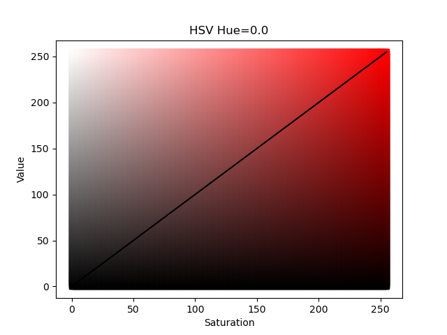 |
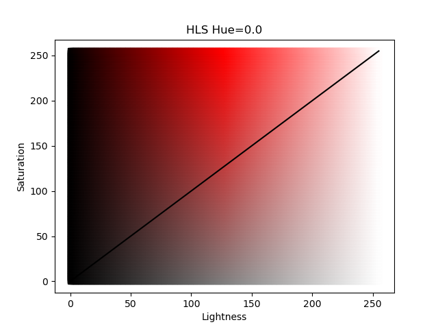 |
import colorsys
import matplotlib.pylab as plt

hue = 0.0

for saturation in range(256):
    for value in range(256):
        rgb = colorsys.hsv_to_rgb(hue/256.0, saturation/256.0, value/256.0)
        plt.plot([saturation], [value], marker="s", color=rgb)

plt.plot([0,255], [0,255], marker="none", linestyle="-", color="black")
plt.xlabel("Saturation")
plt.ylabel("Value")
plt.title(f"HSV Hue={hue}")
plt.show()
|
import colorsys
import matplotlib.pylab as plt

hue = 0.0

for saturation in range(256):
    for lightness in range(256):
        rgb = colorsys.hls_to_rgb(hue/256.0, lightness/256.0, saturation/256.0)
        plt.plot([lightness], [saturation], marker="s", color=rgb)

plt.plot([0,255], [0,255], marker="none", linestyle="-", color="black")
plt.ylabel("Saturation")
plt.xlabel("Lightness")
plt.title(f"HLS Hue={hue}")
plt.show()
|
The figures above show the HSV and HLS color systems for a fixed value of Hue; in these examples Hue is set equal to 0.0 which is the color red. The solid black diagonal line represents the colors used by the energy_hue_map script as it uses the same value for saturation and value (for HSV) or lightness and saturation (for HLS). In the HLS color system , a value of 0 lightness produces the color black (regardless of the saturation or hue) and a value 255 produces the color white; the "most red" red color is in the middle of the color space. Compare that to the HSV color system where the "most" red color is along the diagonal. Both color systems have their advantages as will be shown in the follow example.
Example.
For this example we are going to look at RCW 103 using a merged dataset.
For brevity, we just show the full list of commands below with some commentary afterwards. This is for bash/ksh/zsh/dash shell users. See the first example for equivalent syntax for tcsh shell users.
# Download and recalibrate
download_chandra_obsid 123,12224,11823,17460,18459,18854 --quiet
chandra_repro 123,12224,11823,17460,18459,18854 out= clob+

# Merge datasets
/bin/ls */repro/*evt2.fits > evt.lis
merge_obs @evt.lis"[ccd_id=0:3]" out=merge/rcw103 bin=2 band=broad clob+

evt=merge/rcw103_merged_evt.fits
exp=merge/rcw103_broad_thresh.expmap
img=merge/rcw103_broad_thresh.img
fov=merge/rcw103_merged.fov

# Adaptively smooth
dmimgadapt "${img}[sky=region(${fov})][opt full]" \
  img.asm \
  fun=gaus min=1 max=20 numrad=40 radscale=linear counts=25 \
  radfile=img.radii \
  mode=h clob+

dmimgcalc $img none unit.img op="imgout=((img1-img1)+1)" clob+
dmimgadapt "${exp}[sky=region(${fov})][opt full]" \
  exp.asm \
  fun=gaus inrad=img.radii innorm=unit.img \
  mode=h clob+

dmstat exp.asm cen- sig- med- verb=0
maxexp=`pget dmstat out_max`
dmimgcalc img.asm,exp.asm none flux.asm \
  op="imgout=(img1/(img2/${maxexp}))" clob+

# Create map file, use new centroid_map tool
centroid_map \
  infile="flux.asm[sky=circle(4139,4010,800)][opt full]" \
  out=centroid.map \
  numiter=10 \
  clob+ mode=h verb=2

# Create energy map
statmap \
  infile="${evt}[energy=500:7000]" \
  mapfile=centroid.map \
  outfile=img.energy \
  col=energy stat=median \
  mode=h clob+

energy_lo=1000
energy_hi=1400

aconvolve img.energy img.energy.sm \
  "lib:gaus(2,5,1,2,2)" mode=h clob+

# Create energy hue map
energy_hue_map \
  infile=flux.asm \
  energymap=img.energy.sm \
  outroot=ehm \
  min_energy=$energy_lo max_energy=$energy_hi \
  min_counts=0 max_counts=INDEF \
  colorsys=hls \
  mode=h clob+

# Display
ds9 -rgb -red 'ehm.fits' -linear -scale limits 0 255 \
    -green 'ehm.fits[GREEN]' -linear -scale limits 0 255 \
    -blue 'ehm.fits[BLUE]' -linear -scale limits 0 255
The above commands are very similar to the example using HSV. Rather
than using fluximage to create an image for a single
observation we instead use merge_obs to create
co-added images from several observations. The images are then
adaptively smoothed and exposure corrected and normalized as before.
Then to create the map file we use the ![[New]](../../imgs/new.gif) centroid_map
tool. This tool creates a map by creating a Voronoi tessellation of
the local maxima, computing the centroid in each cell, and then repeating
the processing using the centroids to create a new tessellation.
The results after 10 iterations is shown in Figure 11.
The median energy map is created using statmap which
is then combined with the exposure corrected counts image using
energy_hue_map with colorsys=hls. The output is
shown in Figure 12.
centroid_map
tool. This tool creates a map by creating a Voronoi tessellation of
the local maxima, computing the centroid in each cell, and then repeating
the processing using the centroids to create a new tessellation.
The results after 10 iterations is shown in Figure 11.
The median energy map is created using statmap which
is then combined with the exposure corrected counts image using
energy_hue_map with colorsys=hls. The output is
shown in Figure 12.
Figure 11: Centroid map for region around RCW 103
![[Thumbnail image: A circular image with multi-color quasi-hexagonal shapes. A colorbar at the bottom shows random colors.]](hls_centroid_map.png)
[Version: full-size]
Figure 11: Centroid map for region around RCW 103
The map file created using centroid_map. The input file was filtered with a circular region (for simplicity, to avoid other sources in the field-of-view). Zooming in, users will notice that the shapes of the individual regions are roughly approaching hexagonal shape and have an overall general uniformity especially on local scales; this is one of the advantages of using the centroid_map algorithm.
Figure 12: Energy Hue Map of RCW 103 using colorsys=hls
![[Thumbnail image: ]](hls_energy_hue_map.png)
[Version: full-size]
Figure 12: Energy Hue Map of RCW 103 using colorsys=hls
The energy hue map of the broad band events. Median energies at or below 1000 eV are red and median energies at or above 1400 eV are violet. The data are combined from several full-field ACIS-I observations (note: there are several subarray observations of just the central object in the Chandra archive.)
While Figure 12 and Figure 9 have a similar looking color scheme, the key difference is the white feature in the middle of the image. In the HSV color system, pixels with maximum intensity have maximum color saturation, so for example the "red-est" of red colors. In the HLS color system, pixels with the maximum intensity, indifferent of the color hue, are white. The HLS color system then is not as useful when there is generally uniform intensity as all pixels will be white essentially resulting in a loss of spectral information. However in this dataset where there is a single central object which is brighter than the surrounding emission it makes for a good visualization. Users should experiment with both options to produce an image that best communicates the results they are trying to convey.
Summary
In this thread we introduced the energy_hue_map script which produces true color images based on combining information about an object's intensity (encoded in the saturation and "value") and an object's spectral variation (encoded in the color hue). We showed how to adjust the limits parameters to extract a visually appealing and still scientifically meaningful image that can be used to communicate results as well as drive further detailed analysis.
While this thread demonstrated the use of energy_hue_map in the context of median energy, this same technique can be applied to other properties. For example if a user has a true temperature map created by fitting spectra, that could be used as the energymap parameter to display the spatial-temperature relations in a dataset. Another example could be a mean or median time map (ie using statmap with column=time) which may be used to show time variability. Basically any continuously varying parameter could be used. This is also not restricted to just Chandra data. One could for example use this technique to combine IXPE polarization data with say a Chandra image. The only requirement is that the images be the same size and provided on the same WCS grid; which can be done using the reproject_image tool.
History
| 09 Jan 2024 | First publication of this thread. |