Download the notebook.
From Sound to Image: How to Visualize Audio Waveforms with CIAO and DS9
Overview
Synopsis
This is not a traditional CIAO thread. Instead of showing how to obtain scientific results, it demonstrates several image processing techniques; in this thread those techniques are used to create a visualization of an audio clip.
Purpose
In this thread you will learn
ds9can readPNGformat images.- The difference between
exportandsaveimage. - How to smooth with an asymmetrical convolution kernel.
- How to use one image as a cookie-cutter template (aka mask) to filter another image.
- Using
dmimgprojectanddmimgreprojectto generate different images. - What are color tags and how to use them.
- How to use custom colormaps.
Related Links
- Using Contrib Color Look-Up Tables thread
- Create a Color Spectrum thread
- True Color Images thread
- Creating Energy Hue Maps thread
Get Started
This thread was last updated using:
ciaover
CIAO 4.17.0 Friday, December 06, 2024
  bindir      : /export/miniforge/envs/ciao-4.17/bin
  CALDB       : 4.12.2
echo "Last run $(date)"
Last run Thu Sep 4 15:51:51 EDT 2025
bash_kernel
This thread is written as a Jupyter notebook using the bash_kernel. To install the bash_kernel you can run these commands:
pip install bash_kernel
python -m bash_kernel.install --sys-prefix
jupyter kernelspec list
The last line should list bash_kernel installed in your CIAO distribution.
Note: Inside this notebook the display < filename.png command works because of the bash_kernel. It is meant to mimic the display command line application that is part of the ImageMagick suite of image processing tools. If you are running these commands outside of the notebook should use your systems image viewer instead.
Obtain audio file
For this particular thread we obtained the full audio of the STS-93 launch from online resources and cropped out the 18 seconds at launch (click to download the audio file).
The audio says:
10…9…8…7…6…5…4…3. We have a Go for engine start. 0. We have booster ignition and liftoff of Columbia reaching new heights for Women and X-ray Astronomy.
There are numerous audio file formats and there may be subtleties in how each is handled in the next section.
Create PNG
We start by converting the audio file into a bitmap graphic file format; we chose PNG format due to its lossless quality. We need a bitmap format, rather than a vector format (like SVG/PS/PDF), because we want to create a 2D image and then assign colors to pixels (ie "paint" it).
The audio format will determine the exact commands/modules you need to plot the data. In this example the audio file is in
m4a format. To read this file requires installing some additional packages into your CIAO distribution. These can be installed by running:
pip install pydub ffmpeg
The pydub module supports many audio format including m4a.
The Python code to convert the audio clip into a PNG image looks like:
import numpy as np
import matplotlib.pylab as plt
from pydub import AudioSegment          # Need to pip install pydub ffmpeg

audio = AudioSegment.from_file("STS93-10sec_launch.m4a", format="m4a")

samples = np.array(audio.get_array_of_samples())
xx = np.arange(len(samples))

plt.style.use("dark_background")
fig = plt.figure(figsize=(75, 45))      # units are in inches @ default 100dpi, so 7500x4500 pixels
ax = fig.add_axes([0, 0, 1, 1])         # fill entire plot, no padding for labels/titles/etc
ax.set_axis_off()
plt.plot(xx, samples, color='white', linewidth=1)
plt.savefig("sts93_wave_full.png")
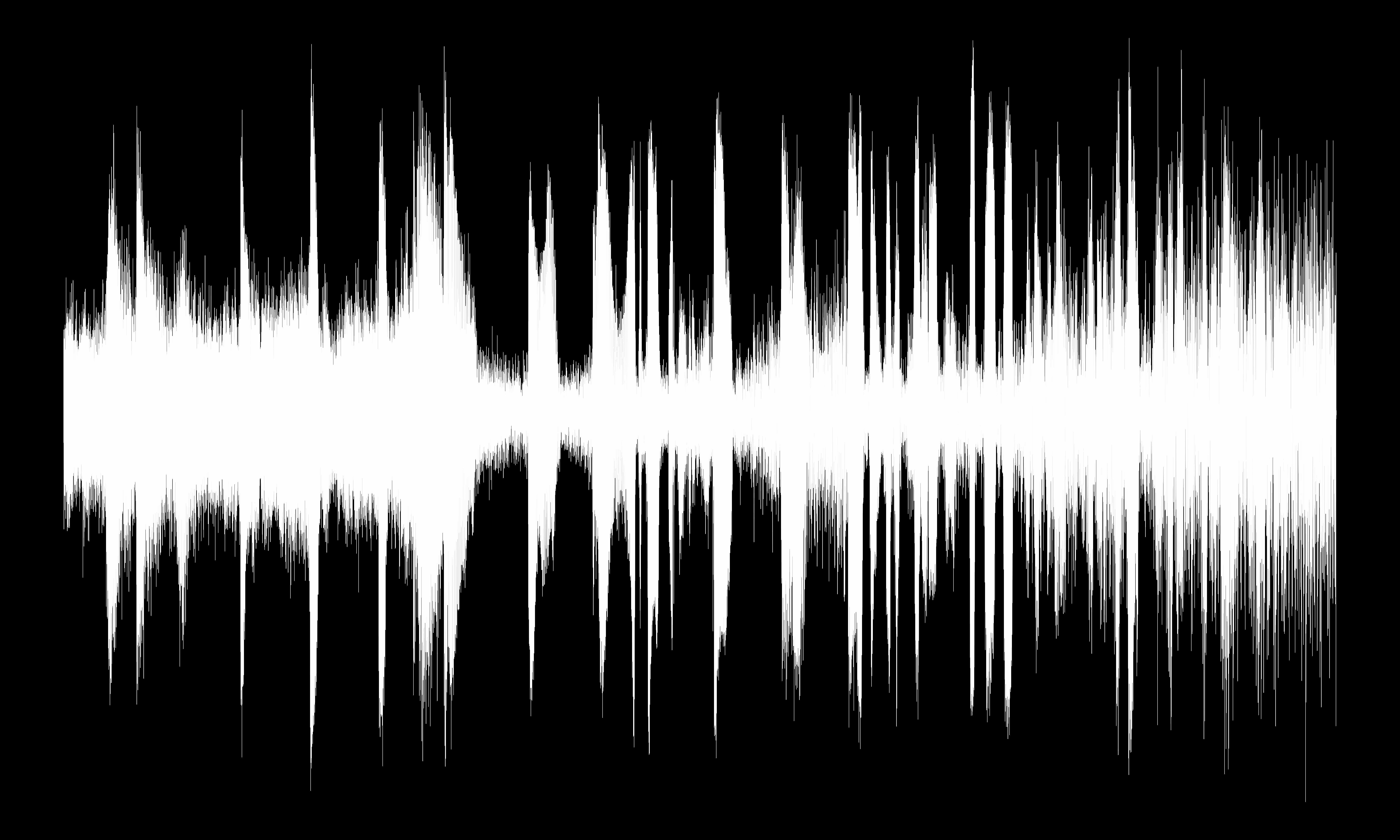
The idea is to create a high resolution PNG file to capture the detailed peaks and valleys in the audio clip. The choice of aspect ratio is arbitrary; the choice here was to accentuate the length of the audio clip.
The plot is created using a black background, since black pixels will map to "0" in the next step. The plot is drawn with a narrow, white line to preserve as much detail as possible.
The PNG looks like
display < sts93_wave_full.png
Convert PNG to FITS
We are going to be using CIAO tools to process this image.
However, CIAO tools cannot read PNG directly so we want to convert the image from PNG format to FITS.
ds9 is used to do the conversion.
ds9 -png sts93_wave_full.png -save ds9.fits -exit
dmlist ds9.fits blocks
--------------------------------------------------------------------------------
Dataset: ds9.fits
--------------------------------------------------------------------------------

     Block Name                          Type         Dimensions
--------------------------------------------------------------------------------
Block    1: PRIMARY                        Image      Byte(7500x4500)
dmlist ds9.fits cols
--------------------------------------------------------------------------------
Columns for Image Block PRIMARY
--------------------------------------------------------------------------------

ColNo  Name                 Unit        Type             Range
   1   PRIMARY[7500,4500]                Byte(7500x4500)

--------------------------------------------------------------------------------
Physical Axis Transforms for Image Block PRIMARY
--------------------------------------------------------------------------------

Group# Axis#
   1   1      X                    = #1
   2   2      Y                    = #2

--------------------------------------------------------------------------------
World Coordinate Axis Transforms for Image Block PRIMARY
--------------------------------------------------------------------------------

Group# Axis#
ds9 reads the PNG and converts it into a grayscale, 8-bit/1-byte image. The FITS pixel values are the mean intensity
from the red+green+blue color channels. So the color black maps to FITS pixels with values equal to zero. The color white
maps to FITS pixels with values equal to 255.
A curious reader may notice that there are actually pixel values spanning the 0-255 range in the image. This is due to how matplotlib creates the plot/PNG, there is anti-aliasing at the edges which produces colors other than pure white and pure black.
Apply Colors to Pixels
Now the fun begins. There are no wrong answers here. This is where creativity takes over.
This section will demonstrate several techniques that one could use to apply colors to the waveform image.
In the examples that use a colormap, two options will be shown:
- The first option will use the
smartcolormap that is included in the CIAO contributed scripts package:$ASCDS_INSTALL/data/smart.lut - The second option will use a different colormap.
DS9
exportvssaveimage.The examples below use ds9's
exportfunctionality.exportandsaveimageare fundamentally different even though both can write bitmap images. Useexportwhen you want the raw-resolution image with scaling and colormap applied (no overlays). Usesaveimagewhen you want a screenshot that includes overlays like regions or contours. In more details:
exportapplies the scaling, limits, and colormap to the entire image, at the original un-zoomed resolution. However, it does not include any annotations (regions, illustrate mode, catalog markers, contours, etc.) Since our input images are 7500x4500 pixels, the output PNGs will also be 7500x4500.saveimagedoes a screen shot of the display area. It includes all the annotations/etc; however it only captures the pixels that are being displayed. The ds9 window must be on top for the screen shot to be taken. The dimensions of the PNG will depend on the size of the display area and will only include the pixels that are being displayed.
There are multiple ways to accomplish the techniques shown below. We have chosen to use CIAO tools although it could also be done using Python.
Horizontal
The first technique we will demonstrate will be to apply a colormap to the waveform in a horizontal direction.
To do this we need to create an image whose pixel values are the X-axis location.
In brief we use dmimgproject to computes per-column (or row) statistics. Then we use dmimgreproject to write those values back into an image by filling each column (or row) with that statistic. Here it is in detail
punlearn dmimgproject
plist dmimgproject
Parameters for /home/kjg/cxcds_param4/dmimgproject.par

        infile =                  Input image file name
       outfile =                  Output file name
          axis = y                Axis to project along
      (verbose = 0)               Tool verbosity
      (clobber = no)              Clobber existing output?
         (mode = ql)
We use dmimgproject to project all the pixels in the input image onto the X axis.
dmimgproject ds9.fits xproj x clob+
The term projection is used very loosely. Essentially dmimgproject computes several statistics for the
column (or row). The SUM or MEAN values are often what is thought of as the projection. We can use dmlist to see
all the quantities that are computed
dmlist xproj cols
--------------------------------------------------------------------------------
Columns for Table Block xproj
--------------------------------------------------------------------------------

ColNo  Name                 Unit        Type             Range
   1   BIN                               Int4           -                    Bin number
   2   X                                 Real8          -Inf:+Inf            location along axis
   3   SUM                               Real8          -Inf:+Inf            Raw projection
   4   NUMBER               pixels       Real8          -Inf:+Inf            Number of valid pixels
   5   MEAN                              Real8          -Inf:+Inf            /pixel
   6   MIN                               Real8          -Inf:+Inf            Min value
   7   MIN_LOC                           Real8          -Inf:+Inf            Location of Min value
   8   MAX                               Real8          -Inf:+Inf            Max value
   9   MAX_LOC                           Real8          -Inf:+Inf            Location of Max value
  10   MEDIAN                            Real8          -Inf:+Inf            Middle value (lower)
  11   MED_LOC                           Real8          -Inf:+Inf            Location of Median value
  12   MODE                              Real8          -Inf:+Inf            Mode=3*median-2*mean
  13   RANGE                             Real8          -Inf:+Inf            Max - Min
  14   QUANT_25                          Real8          -Inf:+Inf            25% Quantile
  15   QUANT_33                          Real8          -Inf:+Inf            33% Quantile
  16   QUANT_67                          Real8          -Inf:+Inf            67% Quantile
  17   QUANT_75                          Real8          -Inf:+Inf            75% Quantile
  18   STDEV                             Real8          -Inf:+Inf            Sigma/Standard Deviation
  19   NMODE                             Real8          -Inf:+Inf            Normalized mode=mode/median
For this first example we are just going to use the BIN value. This gives us a simple running count of
the column number.
The next step then is to fill an image where all the pixels in each column in the image has the same value that is equal to the column number. This is done using dmimgreproject
punlearn dmimgreproject
plist dmimgreproject
Parameters for /home/kjg/cxcds_param4/dmimgreproject.par

        infile =                  Input table file name
       imgfile =                  Input image to match
       outfile =                  Output file name
       (method = weight)          Interpolation method
      (verbose = 0)               Tool verbosity
      (clobber = no)              Clobber existing output?
         (mode = ql)
Another way to think of dmimgreproject is that is it extrudes the 2nd column's value along the 1st columns values.
Here we extrude the bin values with each x column's value.
dmimgreproject "xproj[cols x,bin]" ds9.fits xproj.w_bin clob+

ds9 xproj.w_bin -linear -export xproj.w_bin.png -exit
display < xproj.w_bin.png

The output image has the same pixel value in each column that maps to the column number.
Now what we want to do is extract the waveform image, ds9.fits from this horizontal column map image.
There are different approaches one could take
- treat the
ds9.fitsimage as a pixel mask; however, a bug prevents this from currently working. - Use
dmimgcalcand multiply the waveform image and the column map image. - Use
dmimgthreshwith the waveform image as the exposure map.
We choose to use the last option so then we do not then have to think about what the pixel values mean/are when they are multiplied.
To include all the non-zero pixels we just need to set the dmimgthresh cutoff value to a value strictly between 0 and 1.
dmimgthresh xproj.w_bin horizontal.fits exp=ds9.fits cut=0.5 clob+
Finally we then apply the smart colormap
ds9 horizontal.fits -linear -cmap load $ASCDS_INSTALL/data/smart.lut \
  -export horizontal.png -exit

display < horizontal.png
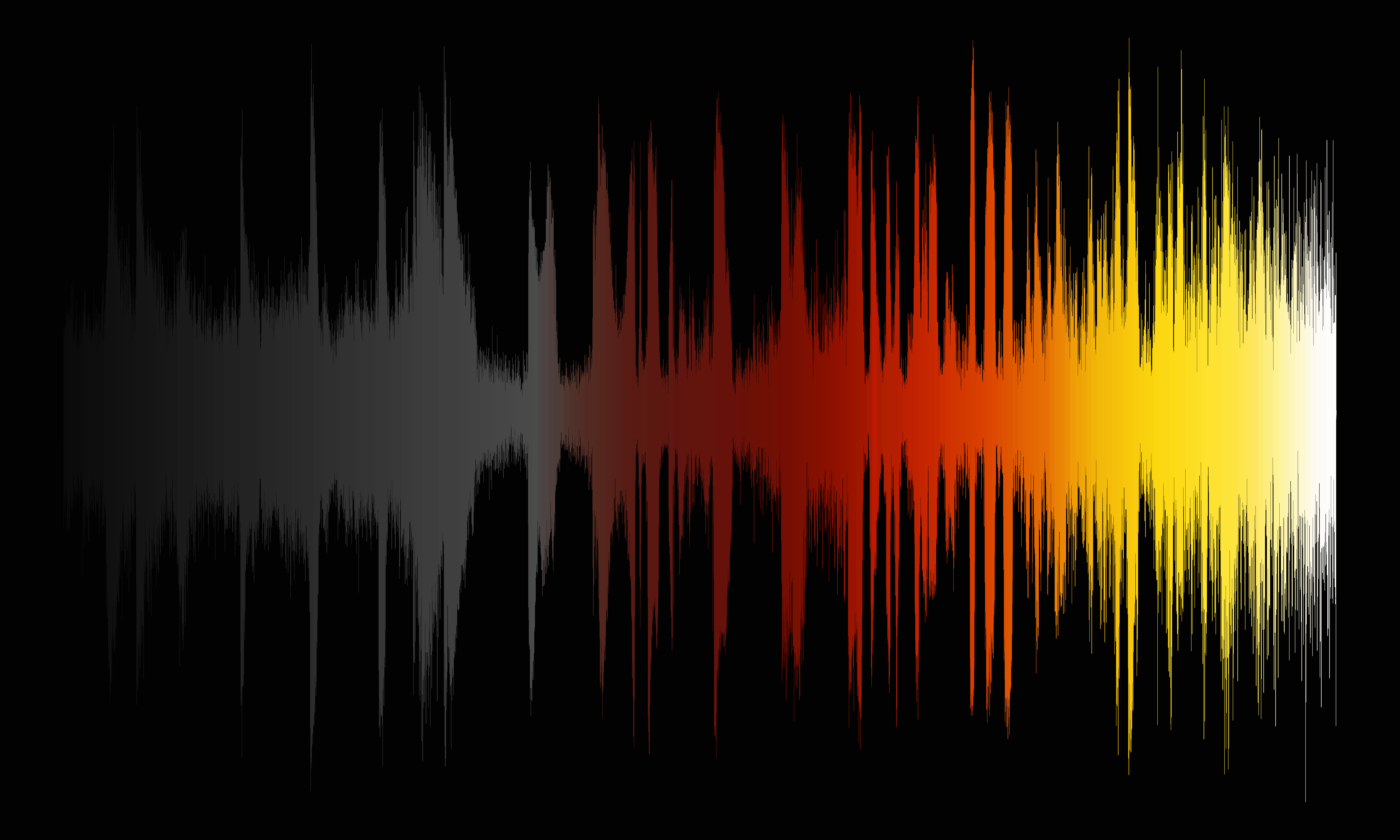
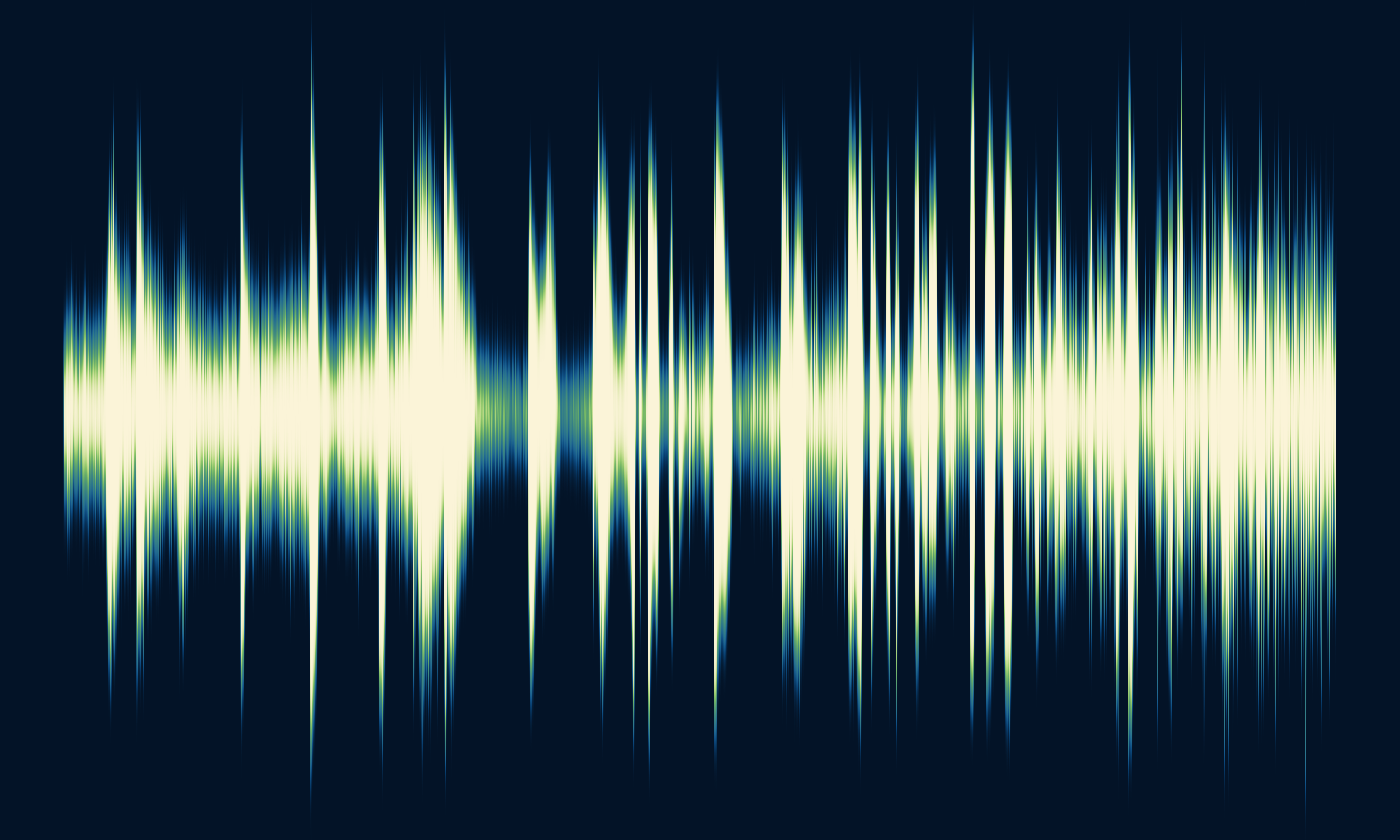
The smart colormap transitions from black to gray to orange to yellow to white.
For the next colormap we are going to use ds9's built in Scientific Colormap scm_bam. This divergent colormap goes from
purple to white to green.
However, since we still want the background to be black we are going to create and use a color tag. Color tags let you assign a specific color to a range of pixel values regardless of the underlying colormap. Color tags are saved as simple ASCII files with 3 columns: start value, stop value, color. Color tags override the colormap for chosen pixel ranges. Here we use them to force the background black so only the waveform shows color.
In this example we color all pixel values between -1 and 300 to be black. Note: ds9 will automatically adjust the values to align to the closest color bin boundaries which is why we use -1 to start to ensure that we pick up the lowest possible value.
echo "-1 300 black" > ds9_h.tag

ds9 horizontal.fits -linear -cmap scm_bam -cmap tag load ds9_h.tag \
  -export horizontal_a.png -exit

display < horizontal_a.png
Horizontal peak-to-peak
The previous example used the column number to assign the colors. In this example we will use the amplitude of the waveform to assign colors.
Again there are various ways to accomplish this; however, for simplicity we are going to make use of the projection file we
already created. The higher the waveform amplitude, the more non-zero pixels there will be in each column, and since the
pixel values are (mostly) the same, then we can use the SUM from the projection file as measure of the waveform
amplitude in each column.
dmimgreproject "xproj[cols x,sum]" ds9.fits xproj.w_sum clob+
dmimgthresh xproj.w_sum horizontal_sum.fits exp=ds9.fits cut=0.5 clob+

ds9 xproj.w_sum -sqrt -export xproj.w_sum.png -exit
display < xproj.w_sum.png

We now see that each column now has a value related to the amplitude of the waveform in that column.
Now we apply the smart colormap as before, this time choosing to use the sqrt scaling option
ds9 horizontal_sum.fits -sqrt -cmap load $ASCDS_INSTALL/data/smart.lut \
  -export horizontal_sum.png -exit

display < horizontal_sum.png
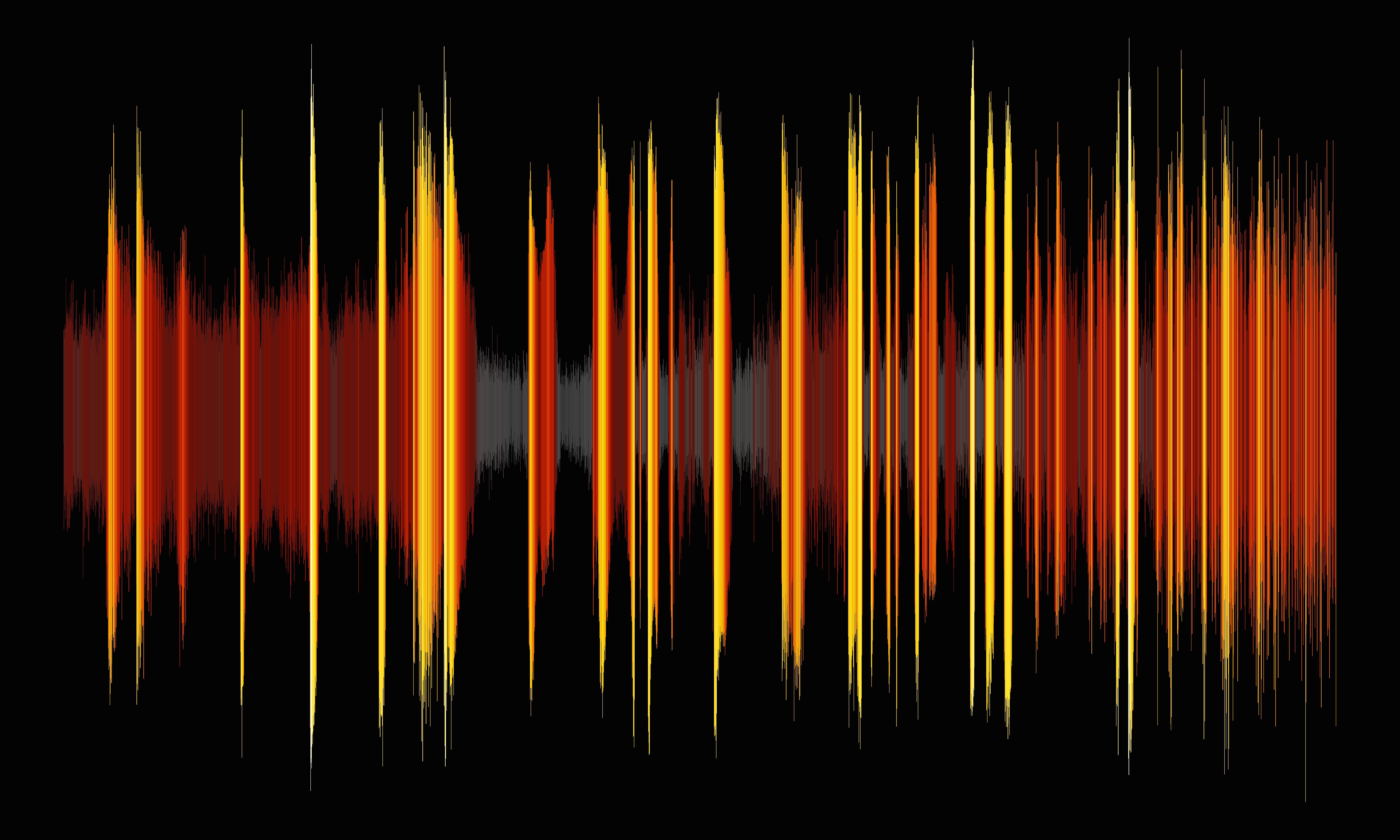
This generates an image with a very different look. The lightest colors: yellow and white, now map to the highest waveform amplitudes.
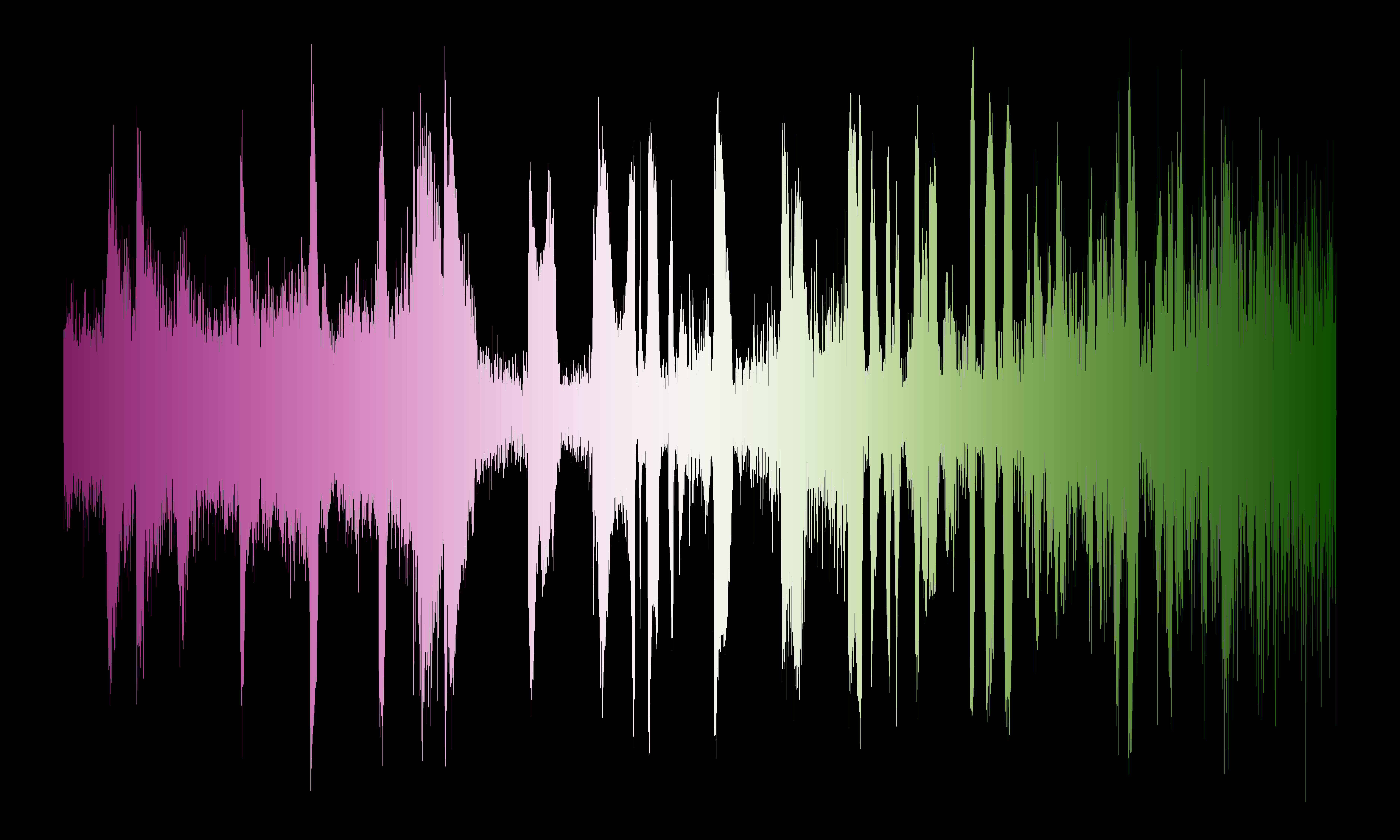
As before we show an alternative colormap, this time ds9's built in scm_romaO colormap, again using a
color tag to set the background color to black.
echo "-1 35000 black" > ds9_c.tag

ds9 horizontal_sum.fits -linear -cmap scm_romaO -cmap tag load ds9_c.tag \
  -export horizontal_sum_a.png -exit

display < horizontal_sum_a.png
Vertical
We can also create a vertical colormap analogous to the first example by projecting rows onto the y axis
dmimgproject ds9.fits yproj y clob+
dmimgreproject yproj"[cols y,bin]" ds9.fits y_proj_a.fits clob+

ds9 y_proj_a.fits -linear -export y_proj_a.png -exit
display < y_proj_a.png

Similar to before but now each row has the same pixel value equal to the row number.
dmimgthresh  y_proj_a.fits vertical_a.fits exp=ds9.fits cut=0.5 clob+

ds9 vertical_a.fits -linear -cmap load $ASCDS_INSTALL/data/smart.lut \
  -export vertical_a.png -exit

display < vertical_a.png

The smart colormap has been applied to the cut-out, vertical row number map. A keen observer will now notice that the smart colormap
has an intentional, subtle discontinuity as it transitions from red to orange.
For the alternative colormap we selected the scm_cork colormap again with a color tag to keep the background black.
echo "-1 150 black" > ds9.tag
ds9 vertical_a.fits -linear -cmap scm_cork -cmap tag load ds9.tag \
  -export vertical_a_diverge.png -exit

display < vertical_a_diverge.png
This divergent colormap lets us color the positive (top) and negative (bottom) parts of the waveform separately.
Offset
Keying off the idea of the previous example we can also create a map that is symmetrical about the center horizontal axis.
Since we know that the image is 7500x4500, the middle row then is
ymid=2250
We can then use that to compute the offset from the middle using dmtcalc
dmtcalc yproj y_offset exp="dist=fabs(y-${ymid})" clob+
And then we can proceed as before to use the dist column
dmimgreproject y_offset"[cols y,dist]" ds9.fits y_offset.fits clob+

ds9 y_offset.fits -asinh -export y_offset.png -exit
display < y_offset.png

dmimgthresh y_offset.fits vertical.fits exp=ds9.fits cut=0.5 clob+

ds9 vertical.fits -asinh -cmap load $ASCDS_INSTALL/data/smart.lut \
  -export vertical.png -exit

display < vertical.png
Here the smart colormap has been applied to the offset map showing symmetrical colormapping about the center
of the waveform.
For our alternative colormap we choose ds9's built in h5_cool colormap with a black background
echo "-1 10 black" > ds9_d.tag

ds9 vertical.fits -asinh -cmap h5_cool -cmap tag load ds9_d.tag  \
  -export vertical_2.png -exit

display < vertical_2.png
Because we wanted the background to be black, the pixels with 0 offset along the center are also set to black. We
could avoid this if we added a constant to the dmtcalc calculation (exercise left for the user).
Distance
The techniques so far have demonstrated how to create different type of maps and then use the waveform as a mask to extract the image to be colored from the map.
This next technique uses a different approach; it apply a transformation to the waveform image.
In this example it is applying a distance transform using the dmimgdist
tool
punlearn dmimgdist
plist dmimgdist
Parameters for /home/kjg/cxcds_param4/dmimgdist.par

        infile =                  Input image file
       outfile =                  Output ASCII region file
    (tolerance = 0)               Tolerance on fraction
      (clobber = no)              Remove outfile if it exists
      (verbose = 0)               Tool chatter level
         (mode = ql)
dmimgdist computes the distance to the edge of the image where the edge is defined to be where pixel values
are less than or equal to the tolerance value (default is 0). Distance is measured in city-block steps: up, down, left, right (so the number or
image pixel edges); diagonal distances are not included.
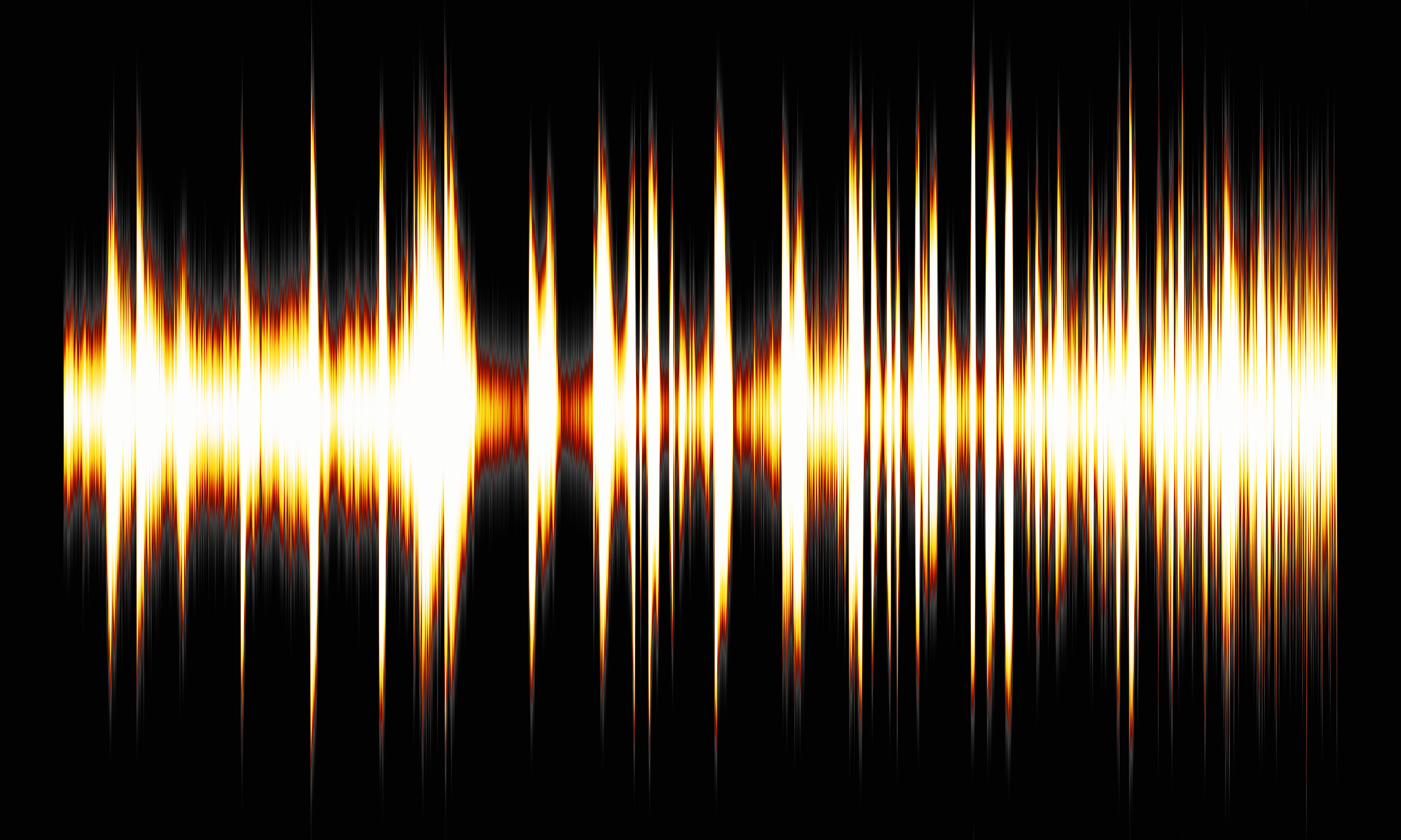
dmimgdist ds9.fits dist clob+
ds9 dist -log -cmap load $ASCDS_INSTALL/data/smart.lut \
  -export dist.png -exit

display < dist.png
The smart colormap applied to the distance transformed image of the waveform. Pixels along the outside of the edge
of the waveform envelope are colored black and gray, and pixel near the central axis, which are generally farthest from the edge
are colored yellow and white.
For the alternative colormap we selected one from the XImage colormaps included in the CIAO contributed scripts
package. The green8 colormap has colors of yellows and greens which gives the image a science-fiction kind aesthetic.
ds9 dist -asinh -cmap load $ASCDS_INSTALL/data/green8.lut \
  -export dist_a.png -exit

display < dist_a.png
The distance image shown here is just one example. One may want to create an image where distance was only measured in one direction; or to actually include diagonal distances. These are exercises left up to the reader.
punlearn aconvolve
plist aconvolve
Parameters for /home/kjg/cxcds_param4/aconvolve.par

#
# aconvolve.par file
#
#
        infile =                  Input file name
       outfile =                  Output file name
    kernelspec =                  Kernel specification
#
# auxillary outputs
#
  (writekernel = no)              Output kernel
   (kernelfile = ./.)             Output kernel file name
     (writefft = no)              Write fft outputs
      (fftroot = ./.)             Root name for FFT files
#
# processing parameters
#
       (method = slide)           Convolution method
        (edges = wrap)            Edge treatment
        (const = 0)               Constant value to use at edges with edges=constant
          (pad = no)              Pad data axes to next power of 2^n
       (center = no)              Center FFT output
   (normkernel = area)            Normalize the kernel
#
# user specific comments
#
      (clobber = no)              Clobber existing output
      (verbose = 0)               Debug level
         (mode = ql)
For this technique we are going to produce a graphic that accentuates the peaks in the waveform; we want to highlight the vertical features in the image.
aconvolve lets the user smooth their data with asymmetrical convolution kernels. In this example we are going to smooth
with a Gaussian convolution kernel that has a $\sigma_x=1$ and $\sigma_y=180$. This is going to stretch the peaks
in the waveform in the vertical direction without blurring out the data in the horizontal direction.
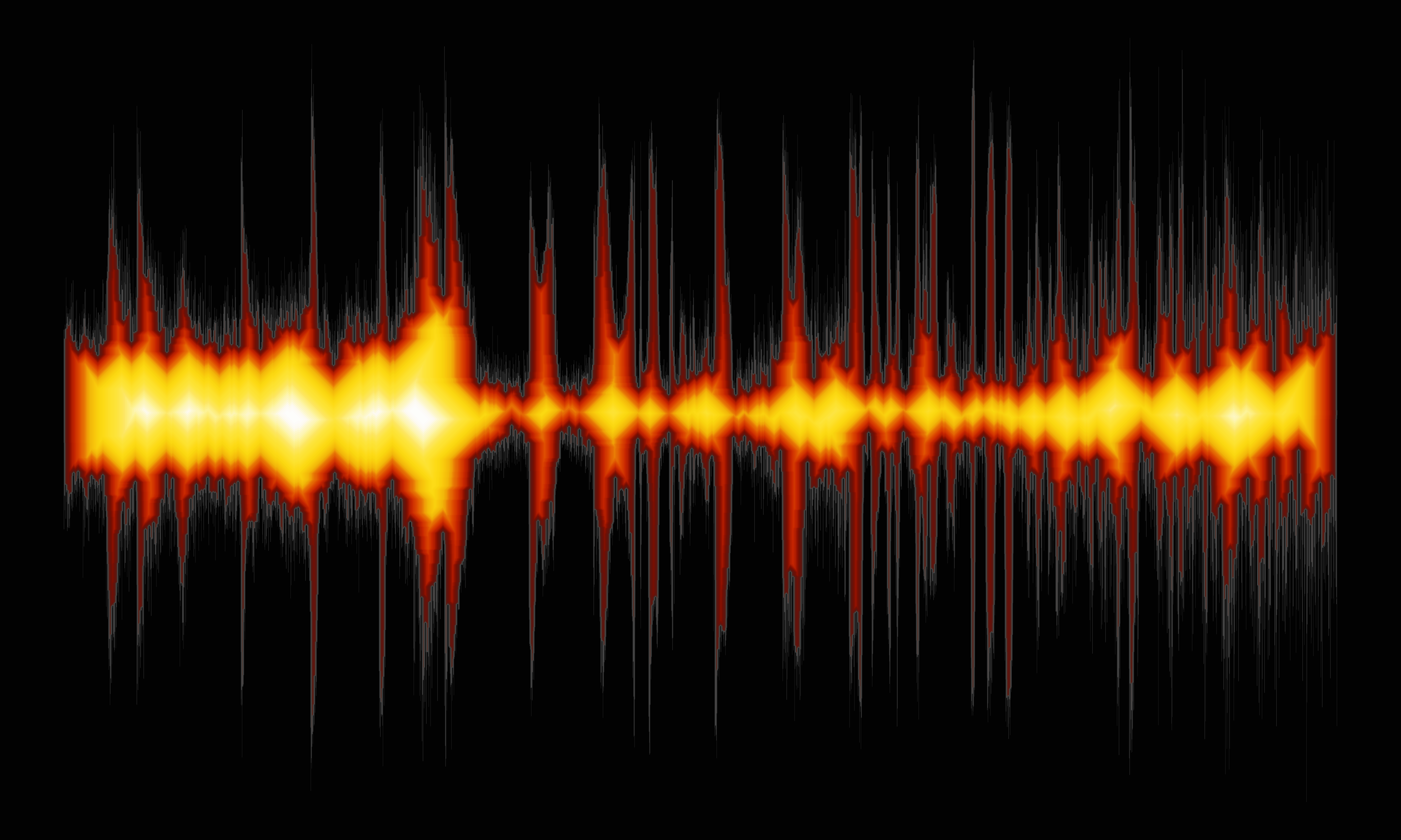
aconvolve ds9.fits conv "lib:gaus(2,5,1,1,180)" method=fft clob+
ds9 conv -linear -cmap load $ASCDS_INSTALL/data/smart.lut \
  -export conv.png -exit

display < conv.png
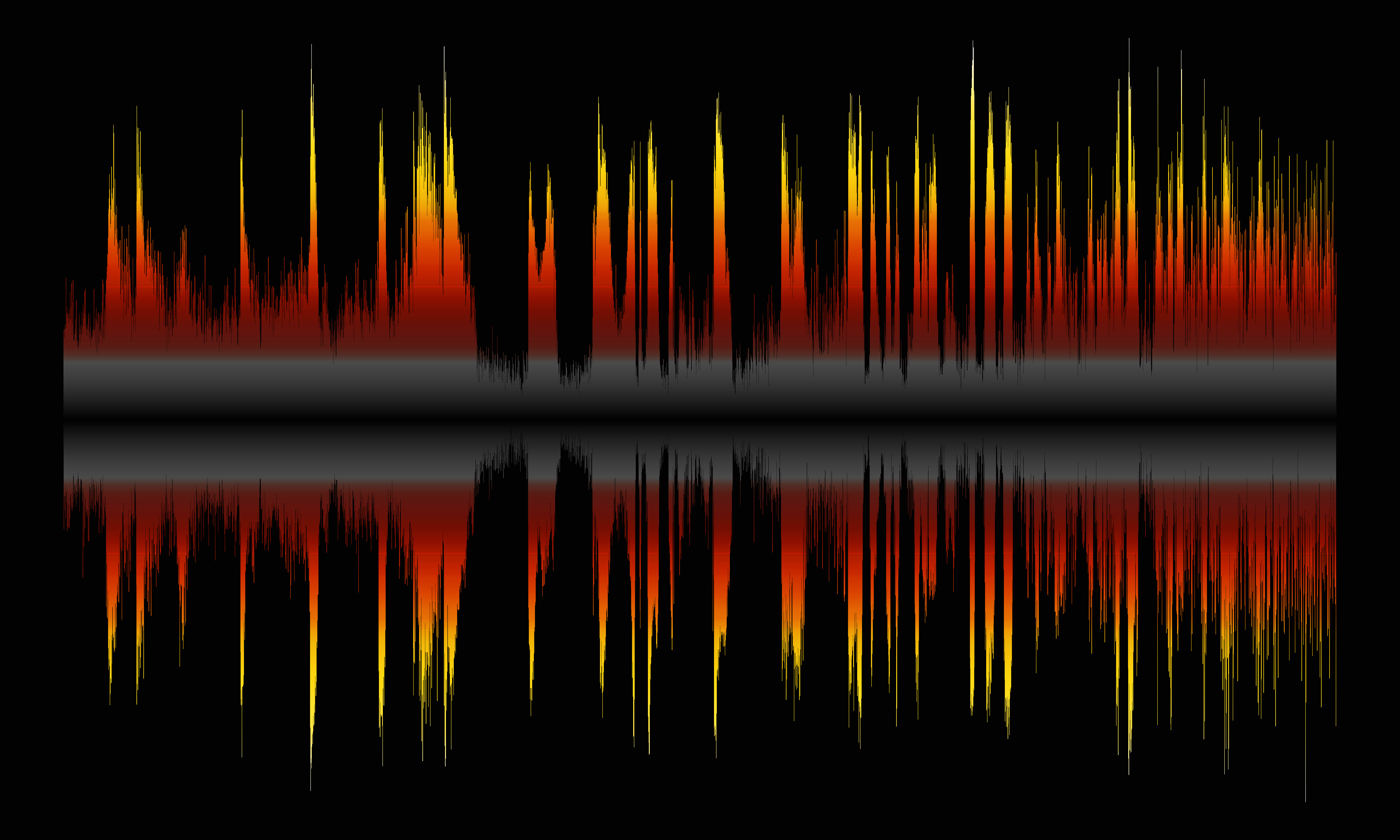
Here the smart colormap has been applied to the smoothed waveform image. The Gaussian smoothing at the edge
essential provides a smooth measure of the distance from the edge of the waveform.
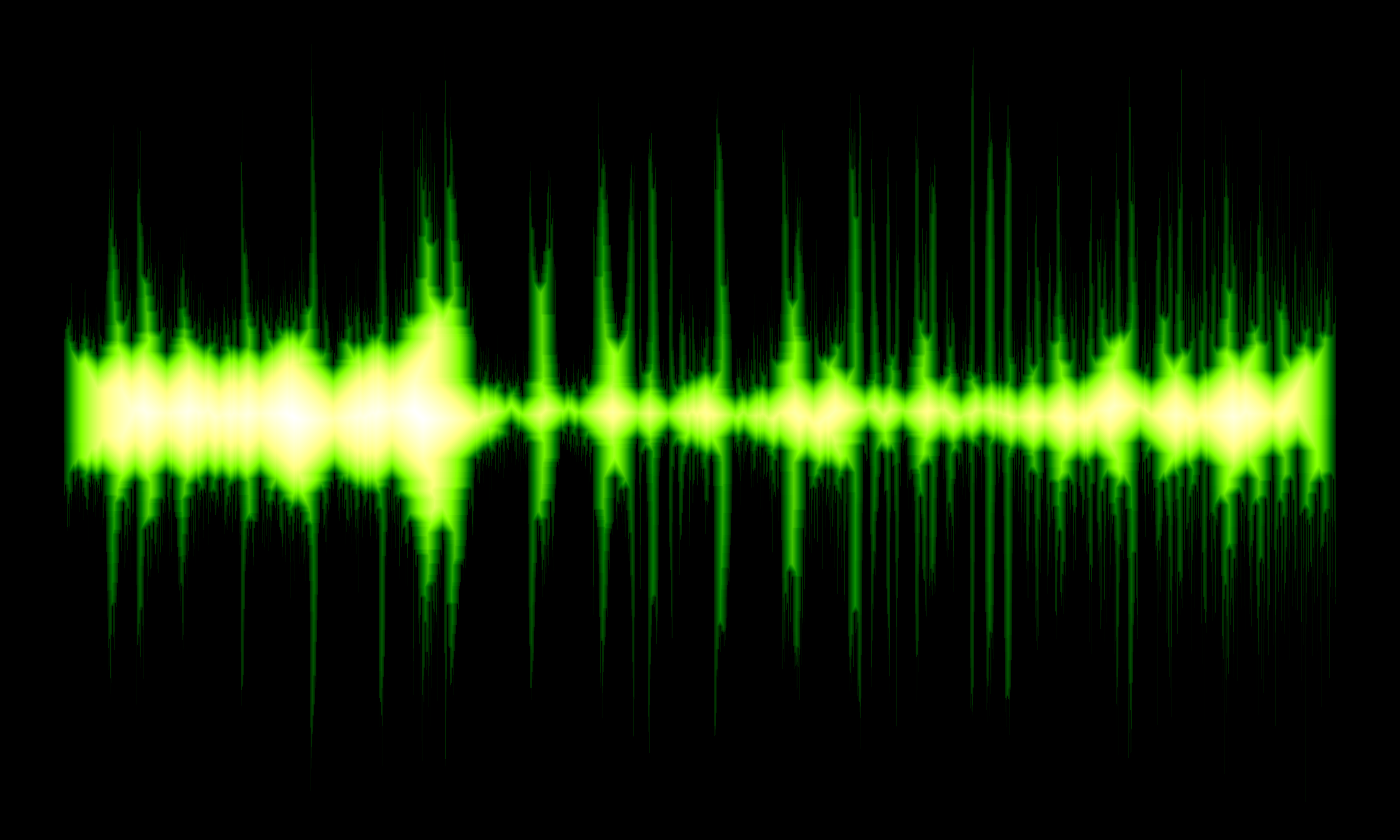
The alternative image is using the scm_navia colormap which provides an image with cooler tones.
ds9 conv -squared -cmap scm_navia \
  -export conv_a.png -exit

display < conv_a.png
RGB, HLS, HSV
The techniques up to this point have relied on using a colormap to assign colors. Different colormaps are useful for different scenarios depending on what the user is trying to emphasize or what aesthetic the user is trying to accomplish.
An alternative approach is to use DS9's support for 3-channel color images: Red Green Blue (RGB), Hue Saturation Value (HSV), and Hue Lightness Saturation (HLS).
By assigning different images to each channel we can achieve different graphic effects.
We will be using the different images generated earlier in this thread.
RGB
With RGB images, each channel maps to one of the primary colors: Red, Green, and Blue. We just need to assign images to each.
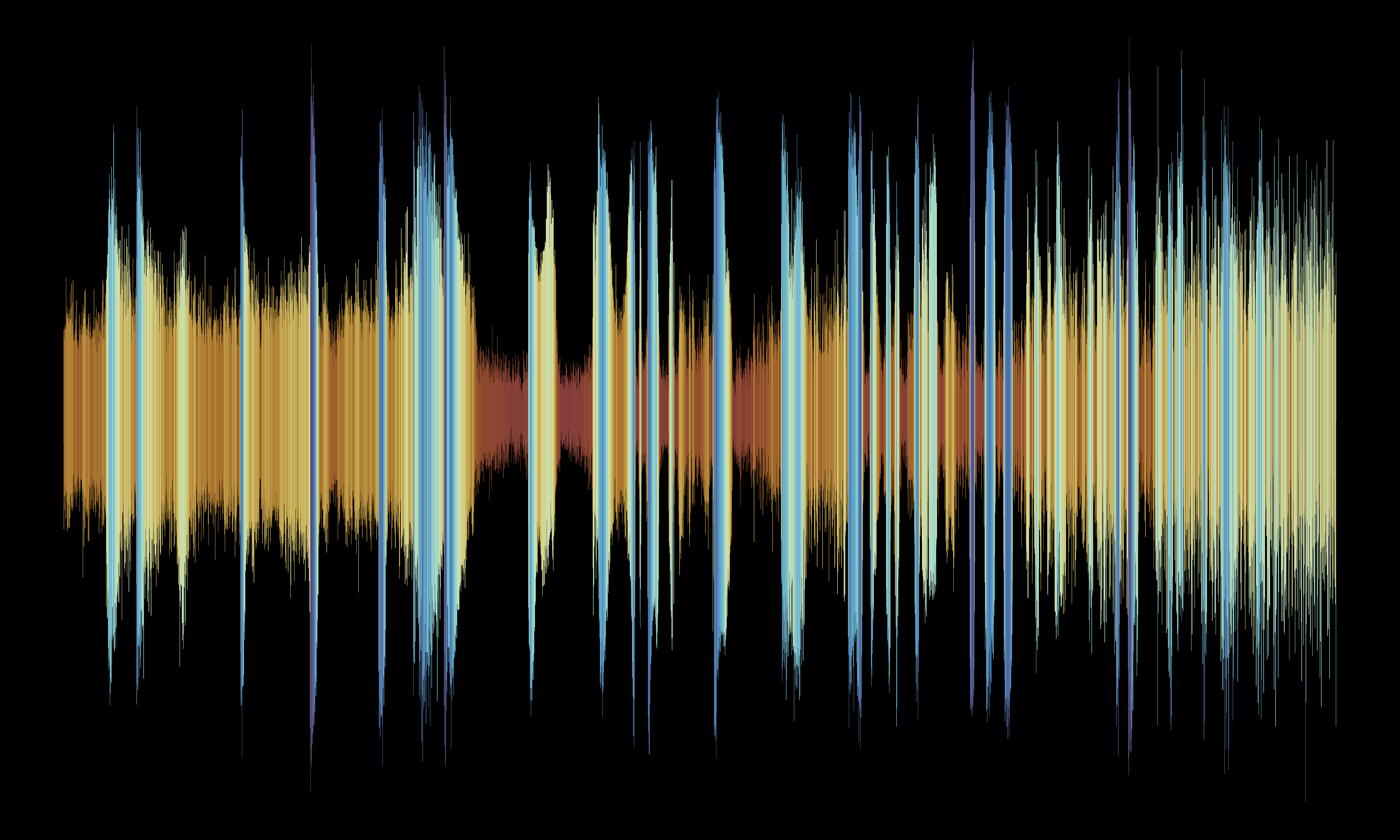
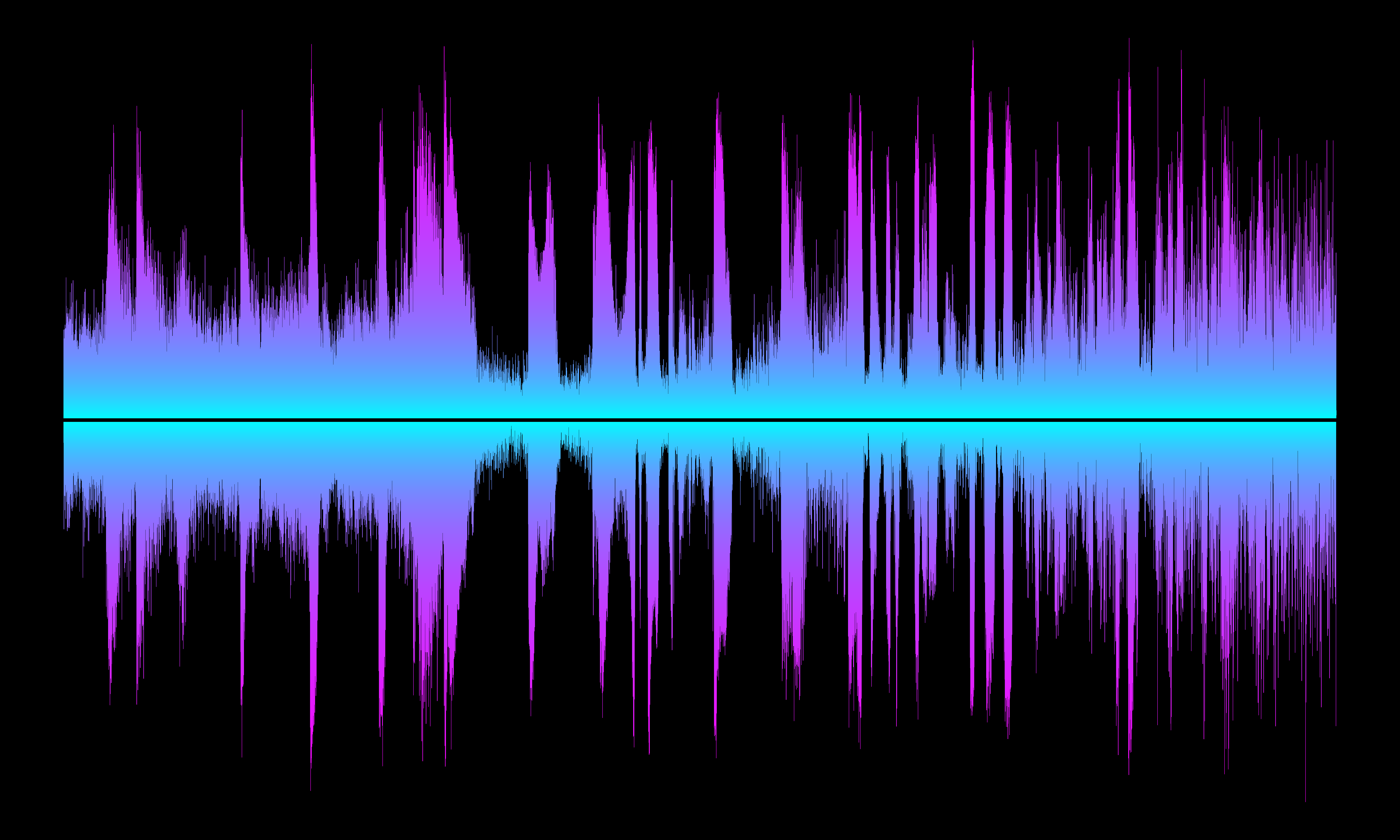
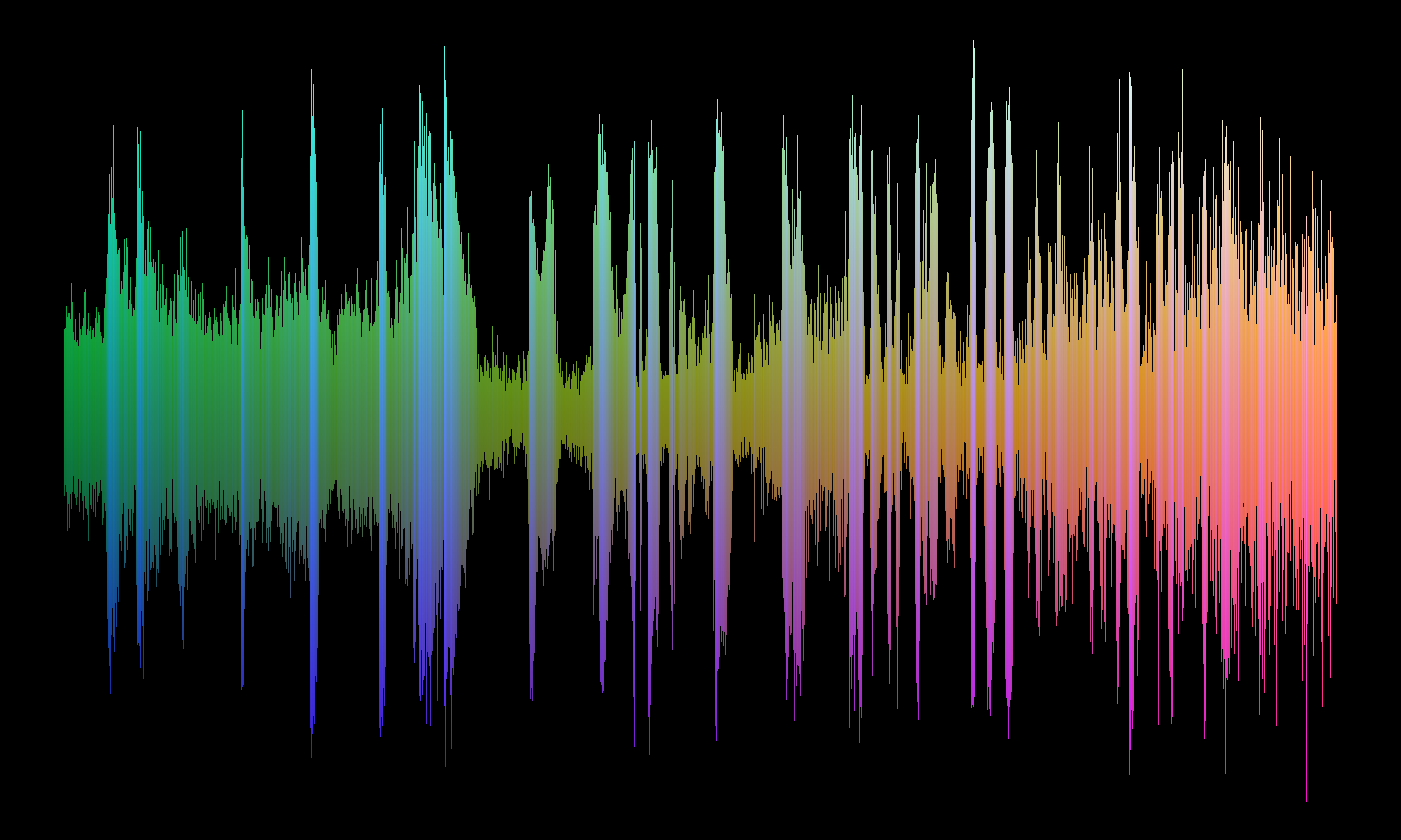
In this example we set the red channel to the horizontal map , so pixels on the left will have the least red and pixel on the right will have the most red. We set the green channel to the vertical map; so pixels towards the bottom will have the least green and pixels closer to the top will have the most green. The blue channel is then set to the peak-to-peak (sum) image; so narrow places in the waveform will have the least blue, and bright, high amplitude places in the waveform will have the most blue.
ds9 -rgb \
  -red horizontal.fits -linear \
  -green vertical_a.fits -linear \
  -blue horizontal_sum.fits -linear \
  -export rgb.png -exit

display < rgb.png
This is just an example with the image files that we happened to have already created. Users could take inspiration from the 3-color gratings thread to partition the waveform image into 3 overlapping sections to create a rainbow effect.
But maybe we can already do that?
HLS
Hue is color: ROYGBIV (red, orange, yellow, etc.)
Lightness is from dark to light.
Saturation is from black/white/grey to full color.
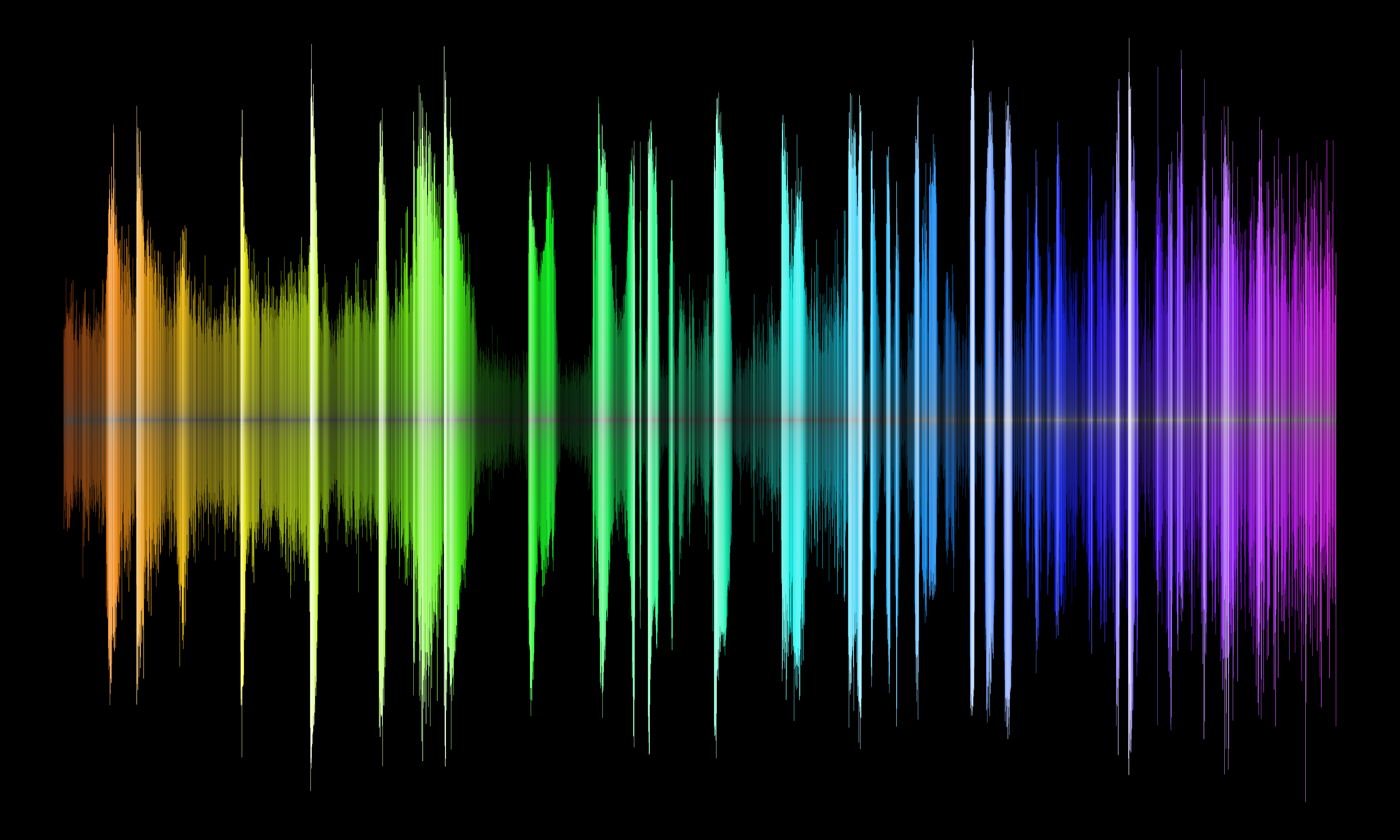
We can use the HLS color system to create a "rainbow" style image
We will use the horizontal colormap for the hue. This will give us the color red on the left through the color purple on the right. Note: Hue is cyclical; the colors wrap back around from purple to red. Since we do not want that we will adjust the colormap to stretch and shift the Hue using the -cmap $contrast $bias option. This will give us colors from red through purple.
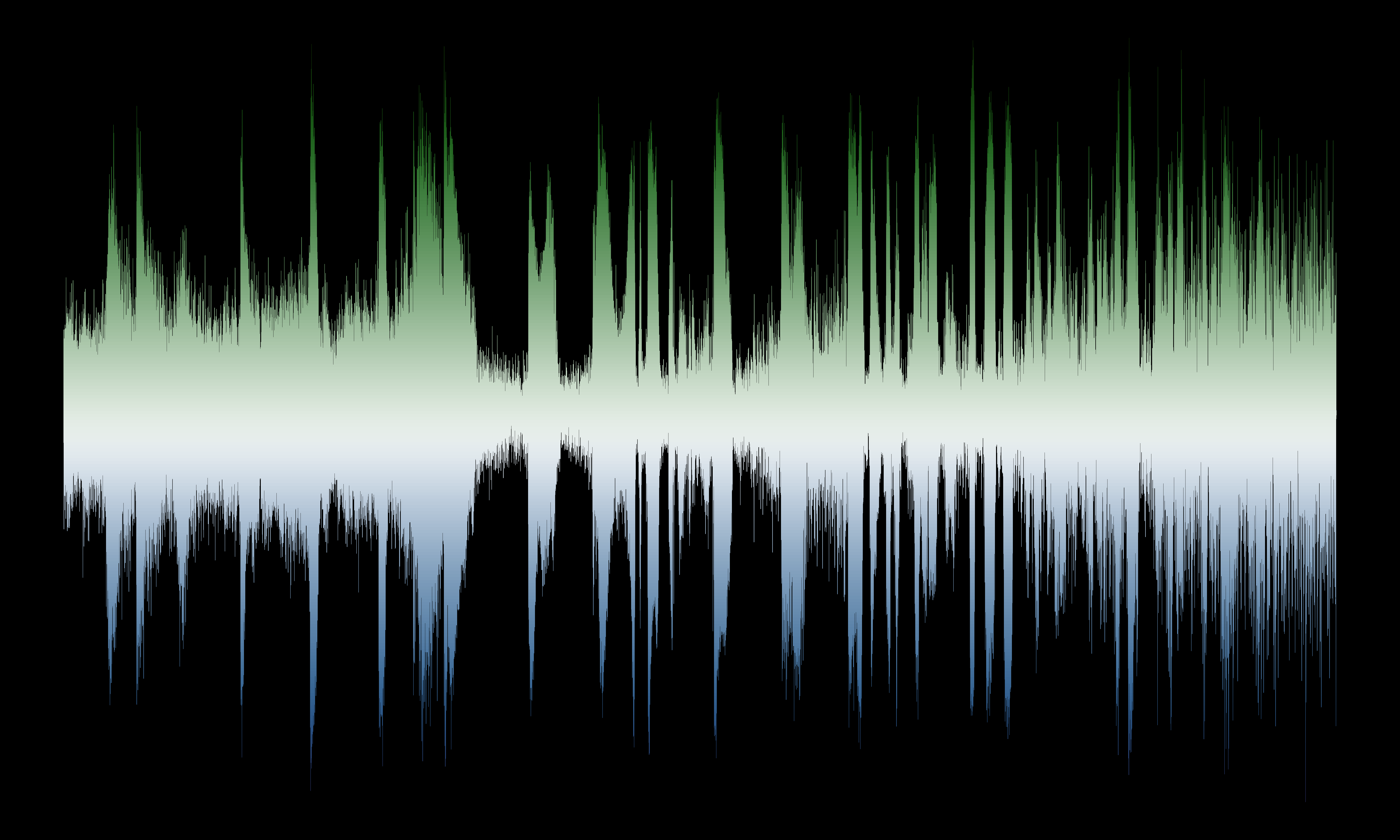
For the saturation we will use the offset-from middle row image. Pixels in the center of the image where the offset is low will have low saturation and will be shades of grey. Pixels at the edge of the waveform will have higher saturation and thus more color.
For the lightness we use the peak-to-peak intensity image. So strong peaks in the waveform will be lighter than the rest of the image.
ds9 -hls \
  -hue horizontal.fits -linear -cmap 0.8 0.6 \
  -saturation vertical.fits -log -cmap 1 0.5 \
  -lightness horizontal_sum.fits -linear -cmap 1.0 0.5 \
  -export hls.png -exit

display < hls.png
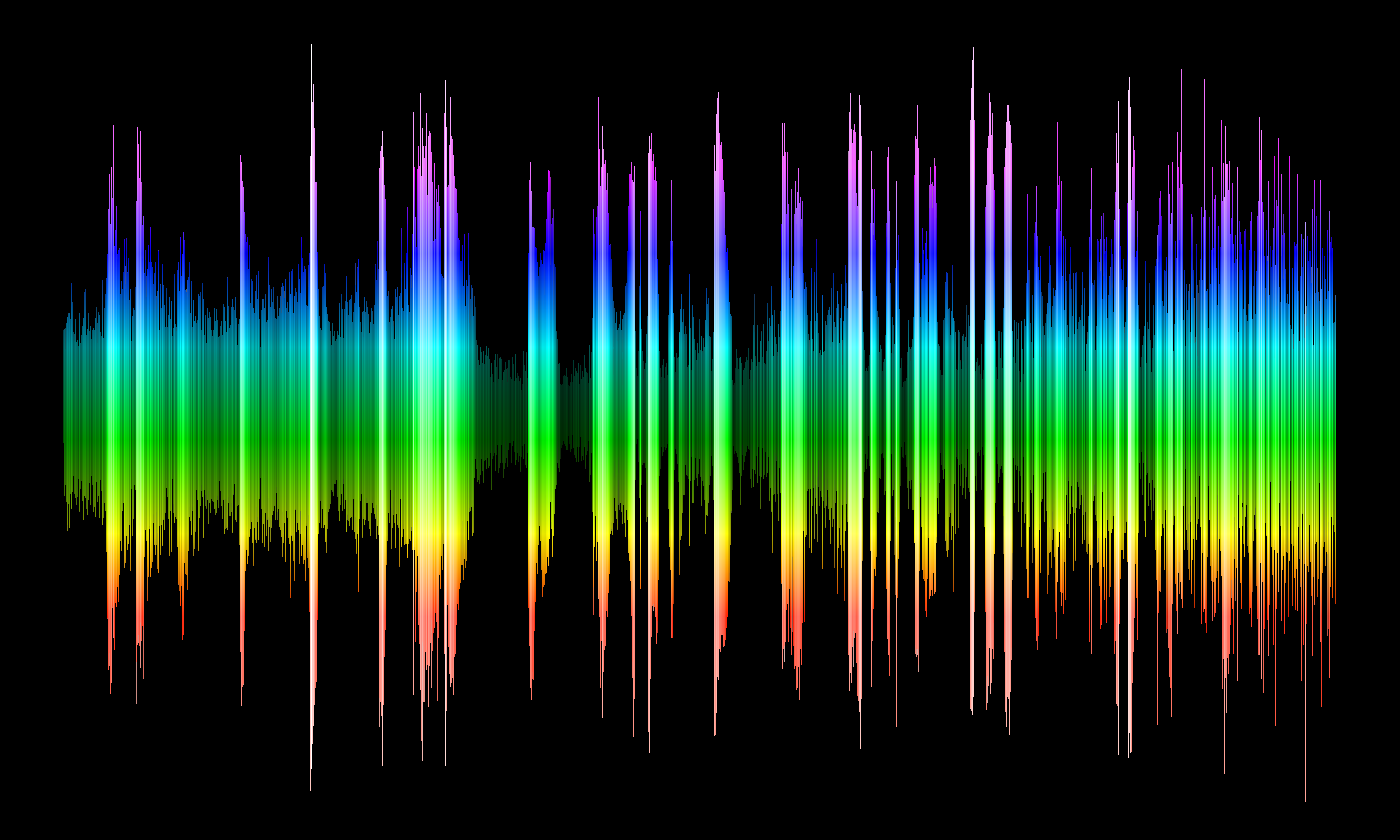
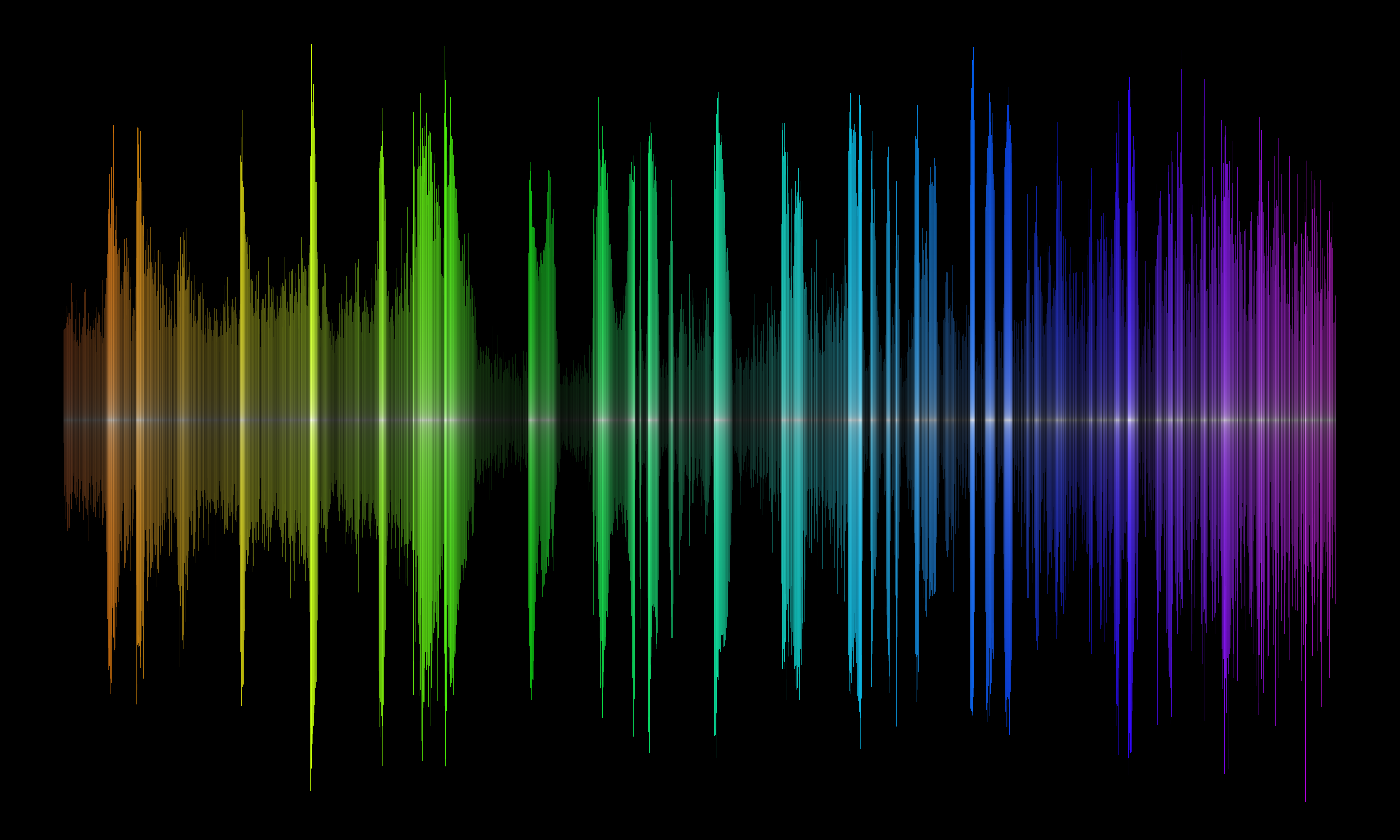
We can make a similar image with the rainbow effect in the vertical direction by using the vertical (row number) map for the hue, and then for this example we choose to keep the saturation (essentially) fixed/maxed by using the waveform image itself
ds9 -hls \
  -saturation ds9.fits -linear -cmap 1.0 0.5 \
  -hue vertical_a.fits -linear -cmap 0.8 0.6 -scale limits 1200 3600 \
  -lightness horizontal_sum.fits -linear -cmap 1.0 0.5 \
  -export hls_b.png -exit

display < hls_b.png
HSV
HSV is similar to HLS. Hue and saturation are the same. The value behaves similar to lightness in that it is the intensity of the color; however at maximum value the color is fully saturated (i.e. full red: 0xFF0000) whereas at full lightness, all colors become pure white (ie 0xFFFFFF). Online resources can better describe the difference in color spaces better than this example ever could.
The HSV image then looks similar but noticeably different than the HLS image with the same inputs.
ds9 -hsv \
  -hue horizontal.fits -linear -cmap 0.8 0.6 \
  -saturation vertical.fits -log -cmap 1 0.5 \
  -value horizontal_sum.fits -linear -cmap 1.0 0.5 \
  -export hsv.png -exit

display < hsv.png
Summary
In this thread you learned how to apply different techniques to create unique visualizations using a combination of
CIAO tools and ds9.
Of course similar visualizations could be created with any number of other packages, including matplotlib.
The image processing and data manipulation techniques shown in this thread are applicable to other areas of research.
Download the notebook.