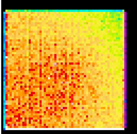
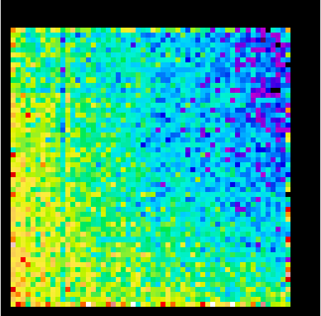
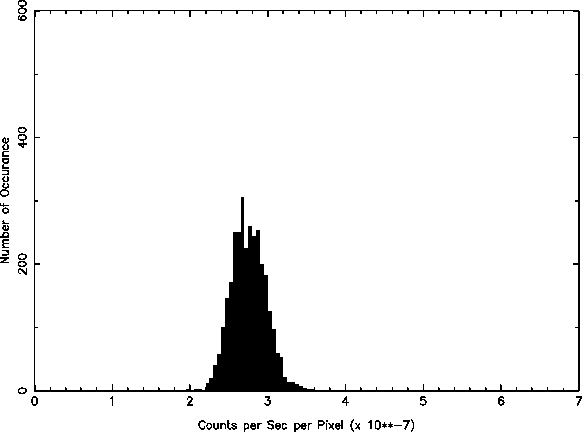
In this page, we explain how to correct HRC I background maps. The following map (Figure 1) is a cumulative map of year 2006. The map pixel size is 256x256 of HRC I pixel. It is already corrected for dead time and the counts are normalized to per second per pixel. The histogram on the right shows the distribution of the count rates. It shows that there are anomalously hight count events (around 5 to 6 x 10**-7 cnt per sec per pixel), and trailing peaks lower than 3 x 10**-7 cnt per sec per pixel. The former is mainly due to "bad" events and can be corrected by status bit filtering (see Figure 2), and the latter is due to the event counts at the edge. At the edge, each pixel still tries to count the events as usual 256x256 pixel size, but in fact there is a less area to cover, and hence the count rates are lower at the edge (light blue/green pixels).
Figure 1: HRC I Map and Count Distribution: No Corrections
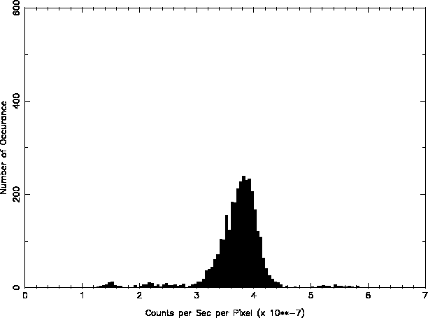
Figure 2 shows the results after status bit filtering. The histogram shows that this filtering removed the higher count events, and shifted all events to lower counts.
Figure 2: HRC I Map and Count Distribution: Status Bit Filtered
To correct the lower peaks, we first need to construct an instrument map. This was done by using CIAO tool, mkinstmap. The parameter settings are as follows:
| Parameter | Values |
|---|---|
| obsfile | input file name |
| pixelgrid | 1:16384:#16384,1:16384:#16384 |
| detsubsys | "HRC-I;IDEAL" |
| outfile | output file name |
| mirror | "HRMA;AREA=1" |
| spectrumfile | NONE |
| monoenergy | 1.0 |
| grating | NONE |
| maskfile | NONE |
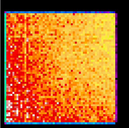
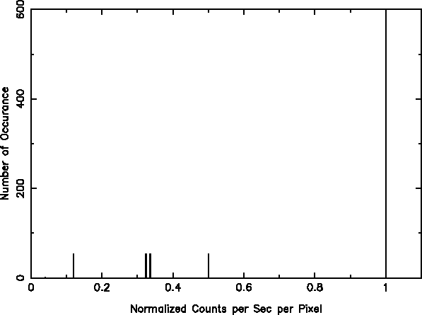
Then, the map is binned into 256x256 pixel size, and normalized to the maximum at 1. The resulted instrument map and the distribution are shown in Figure 3. Three lower peaks on Figure 2 correspond to three peaks at 0.12, 0.33, and 0.5 of Figure 3. The white area on the map is '1', and the light purple, green, and blue area correspond to the lower three peaks.
Figure 3: HRC I Instrument Map and Count Distribution

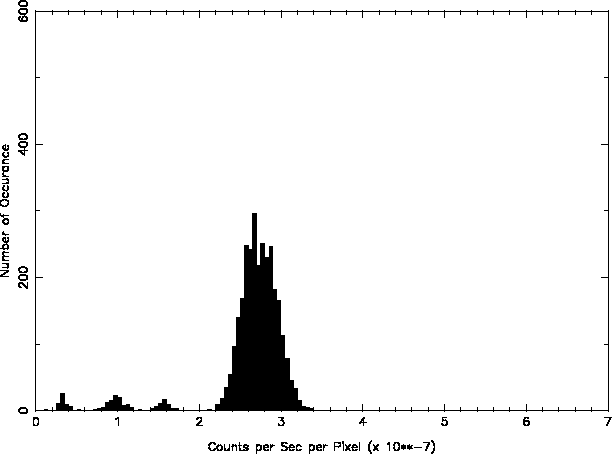
To create the final background map, the status bit filtered map (Figure 2) is divided by the instrument map created above (Figure 3) so that the lower peaks will be corrected and integrated into the main peak. Figure 4 shows the resulted map and the distribution. All lower peaks are now integrated into the main peak. You can, however, still see some mismatches at the edge of the map.
Note, the dynamic range of the map of Figure 4 is set much narrower than the others so that the small discrepancies at the edge of the map can be seen clearly.
Figure 4: HRC I Map and Count Distribution: Status Bit Filtered and Instrument Map Corrected
Last modified: Thu Sep 6 09:52:39 EDT 2007