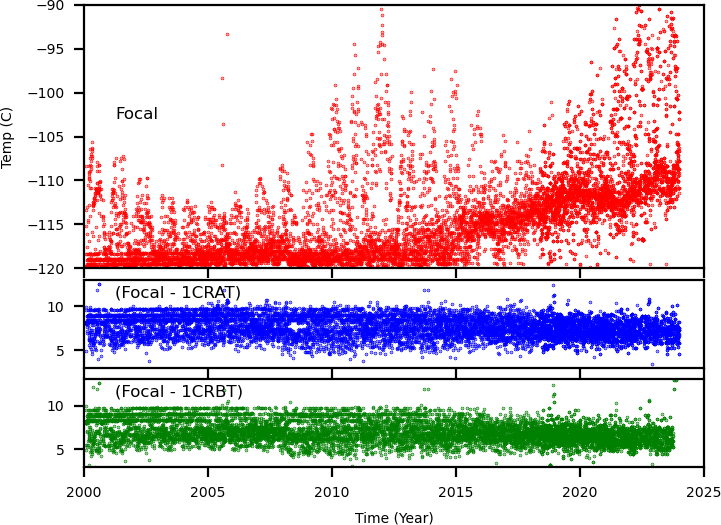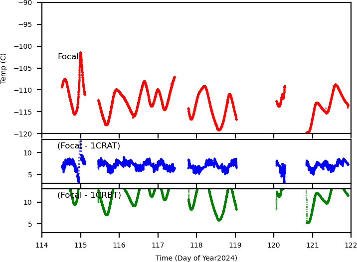

This page displays ACIS focal temperature trend plots and the difference between the focal temperature and the cold plate temperatures (1crat and 1crbt). The left plot below is the trend plot of the maximum temperature of each day and the right one is the trend plot of the most recent one week.
The bottom plot is one year long trend. You can also display a week-long detail trend plot by clicking a week number at the bottom of the plot.
Note: Since 1crat and 1crbt data oscillate with a 2C range, we took a moving average over 10 data points (about 5 mins) to remove double trending lines.
| Daily Max Temperature Since Year 2000 | Most Recent One Week Trend |
|---|---|

|

|
(Click to enlarge, then change the size of the popup window)
Select Year to Open the Plot of the Year
| 2000 | 2001 | 2002 | 2003 | 2004 | 2005 | 2006 | 2007 | 2008 | 2009 | 2010 | 2011 | 2012 | 2013 | 2014 | 2015 |
| 2016 | 2017 | 2018 | 2019 | 2020 | 2021 | 2022 | 2023 | 2024 | 2025 | 2026 |
Move the slider at the bottom of the plot to see the entire year. Or select week # to open a detail plot of the week.
Note: Due to instrumental problems, the focal temperature values taken between dates 2005:259.5 and 2005:289.5 are not reliable.
If you have any questions about this page, please contact tisobe@cfa.harvard.edu
Last Modified: May 25, 2018