Subject: HRC tap corrections
M. Juda
April 17, 2000
1 Introduction
The HRC has a hardware problem that corrupts the data from the
position taps under a specific set of conditions: the amplifier scale
factor is switched to the least sensitive scale, an even number of
taps on the axis have signals that are above a set threshold, and the
event occurs on the negative side of the tap.
When the above conditions are satisfied the tap signals are sampled
while the amplifiers are still ``ringing'' after switching from the
initial guess for the event coarse position to the correct one.
The ``ringing'' results in offsets on the telemetered tap values from
their true values, with the smallest signal of the triplet for an axis
being the most affected.
When the event position is calculated from the corrupted data, the
positions are incorrectly determined and can be off by a few pixels.
It may be possible to at least partially correct the effected data
during ground processing.
This memo describes the appearance of the corrupted tap data in the
HRC-I and proposes a correction that can be applied to the tap with
the smallest signal on an axis that is calculated from the other two
tap values.
2 The Shape of Data
HRC event positions are calculated using the ``3-tap'' algorithm; the
position of the event relative to the coarse position is given by:
|
Xfine = |
A3 - A1
A1 + A2 + A3
|
|
|
where A1, A2, and A3 are the signals from the three taps
centered on the coarse position.
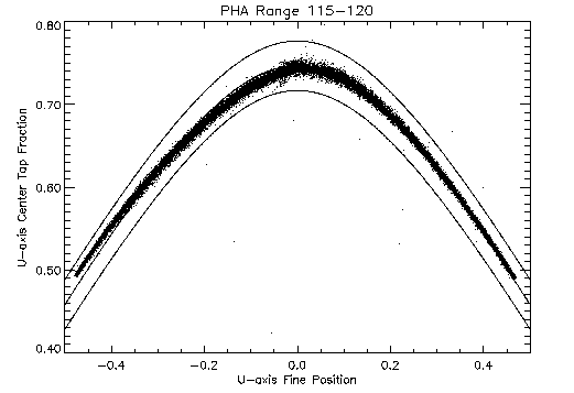
Figure 1 is a scatter plot of fraction of the signal
that is on the center tap versus this fine position for a subset of
the events from an observation of Cas-A (OBSID 1409).
Figure 1: Plot of center tap fraction versus fine position for events
showing the ``hyperbolic'' shape of the locus of well defined positions.
The middle solid-line curve is a hyperbola that follows the locus of
event points.
The upper and lower solid-line curves are hyperbolas that are a
bounding region for a screening test used to preferentially select
x-ray events relative to background events or events that otherwise
have poorly determined positions.
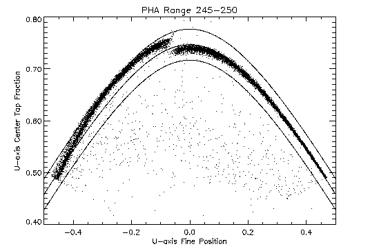
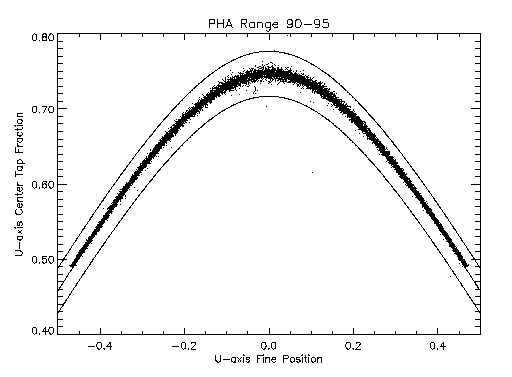
Figures 2 and 3 are similar plots
for two other subsets from the same observation.
Figure 2: Plot of center tap fraction versus fine position for events
showing the effect of ``ringing'' on the fine position
calculation. This subset is from the lower end of the pulse height
range of the affected data.
Figure 3: Plot of center tap fraction versus fine position for events
showing the effect of ``ringing'' on the fine position
calculation. This subset is from the upper end of the pulse height
range of the affected data.
The data for the three subsets are selected based on pulse height,
which is a measure of the total charge collected on the position
sensing grid.
In both of the latter two cases, the locus of points on the positive fine
position side follow the same curve as the data displayed in
figure 1, while most of those on the negative side are
systematically off of the hyperbola that describes the shape of good
positions.
Moreover, between figures 2 and 3 there
are differences in their deviations from the locus of ``good'' points
which depend on the size of the signal measured on the grid.
One difference between the two to note is that the fine position at
which the discontinuity off of the curve occurs becomes more negative
as the pulse height increases.
This effect can be explained by the fact that the ``ringing'' requires
there to be an even number of taps exceeding a threshold and larger
signals allow the events to occur farther away from the center of the
tap before the number of taps above threshold changes from three to two.
The event data plotted in figures 1,
2, and 3 has already been somewhat
processed; better insight into how the data is being corrupted can be
obtained by plotting raw tap data.
Plotted in figure 4 are raw v-axis tap data selected
from the positive side of the central eight coarse positions (CRSV =
26-33, CRSU = 26-33) from the least sensitive amplifier scale (AMP_SF
= 3).
Figure 4: Plot of raw v-axis tap data for positive side of the taps.
Only two of the three tap values are plotted; the abscissa is the
central tap (i.e. the coarse position tap) signal, while the ordinate is the
negative side tap signal (the one from the side opposite where the
event occurred).
The solid lines from the origin show the expected linear relationship
between the tap values at the center and positive edge of the tap as
the signals increase in amplitude.
Figure 5 is a similar plot for the negative side of
the taps with the ordinate being the tap signal from the positive side
of the tap.
Figure 5: Plot of raw v-axis tap data for negative side of the taps.
The corruption of the tap data for events occurring on the negative
side of the tap can be seen as the sinusoidal pattern relative the
expected linear relationship with increasing amplitude.
3 Sinusoidal Deviations
A better look at the sinusoidal distortion of the tap signal can be
obtained by restricting the range of values of the third tap relative
to the central tap
This effectively restricts the events to a limited range of fine
positions.
With this selection of events it is also possible to remove the
expected linear trend between the two tap values and observe the
sinusoidal distortion directly.
If we assume that the relationships between the tap signals should be
symmetric across the tap, then the expected value for AV3/AV2 for a
given AV1/AV2 range can be determined from the observed AV1/AV2 ratio
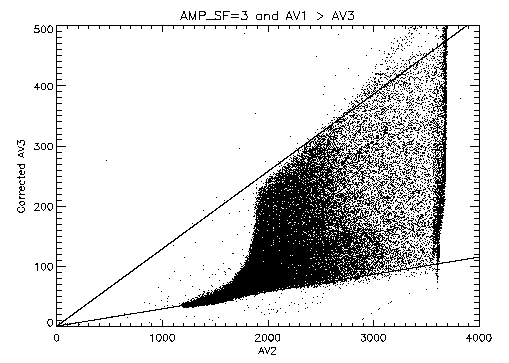
for corresponding AV3/AV2 range on the good side of the GS>Running ppmquant for figures/sweet_neg_av3_av2_0.99.gif
Writing figures/sweet_neg_av3_av2_0.99.gif
GS>Running ppmquant for figures/sweet_neg_av3_av2_0.3.gif
Writing figures/sweet_neg_av3_av2_0.3.gif
GS>Running ppmquant for figures/sweet_neg_au3_au2_0.99.gif
Writing figures/sweet_neg_au3_au2_0.99.gif
tap.
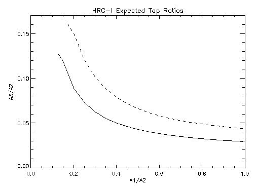
Figure 6 displays the expected relationships between
the ratios of tap values for the two axes of the HRC-I.
Figure 6: Relationship between tap ratios determined from events on the
positive side of the taps. Solid curve: V-axis, Dashed curve: U-axis.
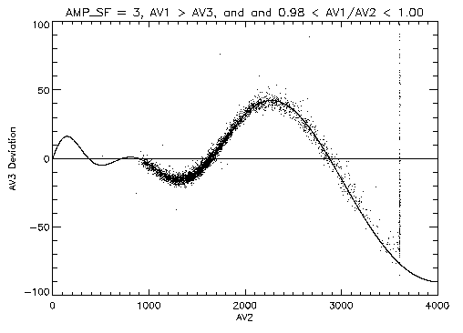
Figure 7 shows the AV3 deviations from the
expected value for only those events for which AV1/AV2 is in the range
0.98-1.00; these are the events near the negative edge of the tap.
Figure 7: Plot of deviations of tap AV3 data from the expected value as
a function of the signal on tap AV2 (expect AV3/AV2 = 0.0293).
The amplitude of the sinusoid clearly increases with the size of the
central tap signal (AV2).
What is less obvious from the figure is that the sinusoid does not
have a fixed period; the period appears to increase with increasing
central tap signal.
Also plotted in figure 7 is a sinusoid with
amplitude and period that are linear functions of the center tap value:
|
|
(
|
AV2 + b
a
|
)
|
sin |
(
|
2Pi |
AV2 - f
cAV2 + d
|
)
|
. |
|
The period function can be determined from the ``zero crossing'' points
of the deviations from the expected value.
The amplitude function can then determined from the observed
deviations at AV2 values where the sine function has a magnitude of 1.
Since there are only two places where the sinusoid goes through zero,
there is a multiplicity in period solutions depending on the phase
adopted for the zero-crossing points (e.g. 1.0 and 1.5, 1.5 and 2.0,
etc.) even after a value for f is selected.
For these data, a phase of 1.5 for the zero crossing at AV2 =
~ 1640 appears to match the data reasonably well with an imposed
constraint of f = 0.
Table 1 lists the sinusoid coefficients used in
this plot.
Table 1: V-axis sinusoid coefficients
| Coefficient | Value |
| a | -35.3 |
| b | -728.0 |
| c | 0.278 |
| d | 638.0 |
| f | 0.0 |
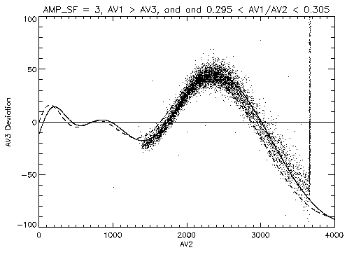
Figure 8 shows a similar plot for events with
AV1/AV2 in the range 0.295-0.305.
Figure 8: Plot of raw v-axis tap data for negative side of the
taps. Data are selected to have 0.295 < AV1/AV2 < 0.305. The
dashed curve is the same sinusoid as plotted in
figure 7. The solid curve differs from the dashed
curve only in the value of f used in the sinusoid.
In this figure the sinusoid that is plotted with a dashed line is the
same as the one in figure 7; clearly, the
zero-crossing points have shifted.
The sinusoid plotted with a solid line differs from the one plotted
with a dashed line only by the value of f (f = 66).
Since the zero-crossing points shift as AV1/AV2 changes, the sinusoid
should be modified by making f a function of AV1/AV2, f(AV1/AV2).
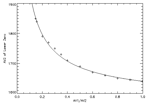
Figure 9 is a plot of the lower of the two
zero-crossing points as a function of AV1/AV2.
Figure 9: V-axis sinusoidal deviation lower zero-crossing point as a
function of AV1/AV2.
The solid curve is a function of the form:
|
a+ b |
(
|
1
(AV1/AV2)g
|
- 1 |
)
|
, |
|
with in this case: a = 1640, b = 75, and g = 0.7.
The functional form of f(AV1/AV2) is the same this curve
but the constants a and b will change.
Since we have determined the amplitude and period functions for the
sinusoid from the AV1/AV2 ~ 1 range while imposing the constraint
f = 0, then a is forced to be zero.
The value of b is modified by the choice of the phase of this
zero crossing point to be 1.5; b = 75/1.5 = 50.
Thus we have:
|
f(AV1/AV2) = 50((AV2/AV1)0.7 - 1) |
|
The u-axis of the detector is affected as well and the sinusoid that
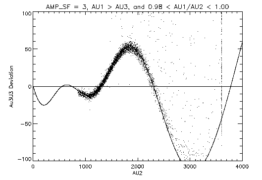
matches the distortion can be found in a similar fashion.
Figure 10 displays the u-axis data analogous to
the v-axis data shown in figure 7.
In this figure the data are selected to have AU1/AU2 in the range 0.98-1.00
so that they are from the negative edge of the tap.
Figure 10: Plot of raw u-axis tap data for negative side of the
taps. Data are selected to have AU1/AU2 in the range 0.98-1.00.
The coefficients of the sinusoid for the u-axis are different from
those for the v-axis and are given in table 2.
Table 2: U-axis sinusoid coefficients
| Coefficient | Value |
| a | 20.0 |
| b | -740.0 |
| c | 0.241 |
| d | 979.0 |
| f | 0.0 |
Again, in determining the sinusoid coefficients for these data, a
constraint of f = 0 has been imposed.
As with the V-axis, the sinusoid shifts in a systematic way as the
AU1/AU2 selection range changes.
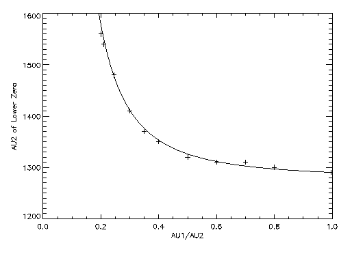
Figure 11 shows how the lower zero-crossing point of the
U-axis sinusoidal distortion changes with AU1/AU2.
Figure 11: U-axis sinusoidal deviation lower zero-crossing point as a
function of AU1/AU2.
The solid curve has the same functional form as the curve in
figure 9 but with a = 1290, b = 12, and
g = 2.0.
4 Sinusoidal Corrections
The two sinusoid curves determined above can be used to correct the
affected data on an event-by-event basis.
The events that affected must meet the following conditions:
- AMP_SF = 3
- A1 > A3 for the axis - one or both can be affected
- A1 > constant×A2 - the constant is different for each
axis and could be zero.
Once the affected events are identified the corrupted tap value can be
corrected:
|
A3corrected = A3telemetered - |
(
|
A2+ b
a
|
)
|
sin |
(
|
2Pi |
A2 -e((A2/A1)g- 1)
cA2 + d
|
)
|
|
|
Table 3 lists the values of the coefficients for
sinusoids for both axes of the HRC-I along with the threshold on
A1/A2 above which the correction should be applied.
Table 3: Sinusoid Correction Coefficients
| Coefficient | V-axis | U-axis |
| a | -35.3 | 20.0 |
| b | -728.0 | -740.0 |
| c | 0.278 | 0.241 |
| d | 638.0 | 979.0 |
| e | 50.0 | 12.0 |
| g | 0.7 | 2.0 |
| A1/A2 threshold | 0.14 | 0.20 |
This function form of the correction with the coefficients listed in
table 3 was applied to an HRC-I observation of
3C273 (ObsID 461) as a test of this correction scheme.
Figures 12 and 13 display the
events from the negative side of the v-axis and u-axis taps
respectively with the corrections applied to the affected events; in
both cases the sinusoidal distortion is greatly diminished.
Figure 12: Plot of corrected v-axis tap data for negative side of the taps.
Figure 13: Plot of corrected u-axis tap data for negative side of the taps.
Figure 12 can be compare directly to a ``before''
picture (from a different data set) in figure 5 and
the raw data from the positive side of the v-axis taps in
figure 4.
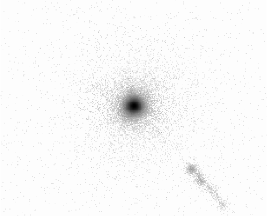
Figure 14 is an image of 3C273 produced using the
corrected data and a linear degapping correction on each axis (U:
1.070, V 1.044).
Figure 14: Image of 3C273 produced using corrected data. The data are
displayed with a logarithmic intensity scale.
The data have been screened to reduce the background events and events
with very poorly defined positions.
The central image is more azimuthally symmetric than an image produced
using the original data.
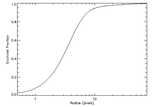
Figure 15 gives the encircled fraction of events
for the source versus radius in pixels.
Figure 15: Encircled fraction of counts from 3C273 versus radius in
pixels (1 pixel = ~ 0.132 arcseconds).
5 Remaining Work
The algorithm for correcting the tap values is effective in improving
the imaging performance of the HRC-I but there are still a few items
that require more work.
There may be some additional refinements to the coefficients to reduce
the remaining residual deviations but the set given here are usable as
a global set.
It is possible that the coefficients could depend on the coarse
position; this should be investigated.
A set of coefficients need to be derived for the HRC-S.
Since the hardware cause for the ringing distortion is known, there is
work in electrical engineering circuit modeling of the response of the
HRC electronics.
The modeled performance needs to be compared in detail to the
laboratory version of the HRC electronics.
It is possible that the knowledge gained from an improved
understanding of the circuit performance can lead to a better
algorithm for the correction, one that originates from first
principles rather than being derived empirically.
Dr. Michael Juda
Harvard-Smithsonian Center for Astrophysics
60 Garden Street, Mail Stop 70
Cambridge, MA 02138, USA
Ph.: (617) 495-7062
Fax: (617) 495-7356
E-mail: mjuda@cfa.harvard.edu
File translated from
TEX
by
TTH,
version 2.65.
On 17 Apr 2000, 15:37.