AXAF will have unparalleled spatial and spectral resolution at X-ray wavelengths, requiring the development of new analysis software and the enhancement of more familiar packages. Here in the ASC, we aim to make the interface to this software as user-friendly as possible. It should be intuitive and easy for the novice user, and flexible enough to accommodate experts. Here I will focus on several aspects of the user interface: the ``First Look" feature, the Graphical User Interface, the Notebook, and the Data Visualizer.
The ``First Look" software is designed to allow you to perform a pre-analysis inspection of your data, but does not require you to have a detailed knowledge of file types, formats, or display and plot commands. For example, you may wish to decide whether your source is variable, is softer in the center of the image, or has obvious Fe emission lines. When you first run the ASC analysis software, an icon will appear on your desktop which, when opened, will look like Figure 11. One of your options will be a ``First Look" button. When clicked, this will spawn an observation browser which will list the AXAF observations in your directories. Click on the observation you want, and the image, lightcurve and spectrum of the whole field will appear (Figure 12). All of these windows are interactive, so you can easily select regions for further analysis.
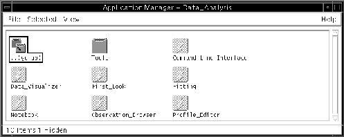
Figure 11:
The top level entry to the data analysis environment. This figure assumes
that you are running the solaris-standard Common Desktop
Environment; other environments will look
similar
All ASC software will be accessible through a Graphical User Interface (GUI) and a Command Line Interface (CLI). The GUIs are designed to lay out information in an easy-to-understand way, and will save you having to type a long command line. For example, you may wish to filter out high background times from your observation and then look at the spectrum of a point source. This can easily be accomplished in the GUIs shown in Figure 12 by interactively deleting the high background times in the lightcurve with your cursor, and then placing a circle around your favorite source in the display window. Alternately you can type:
extract_lightcurve events(skypos=circle 100 200 40 80) /tmp/lt_bkg
display events(/tmp/lt_bkg ![]() 0.04)
0.04)
extract_spectrum events(skypos=circle 100 200 35) /tmp/spec
display /tmp/spec
However, you are not *forced* to use the GUI, and can switch from using the CLI to the GUI. All GUI commands are translated into their CLI equivalents and displayed in an editable window. This means that you can recall and edit previous commands, or simply execute commands via the CLI.
The Notebook and logs are designed to give you comprehensive electronic record-keeping facilities to keep track of your analysis and help with script writing and trouble-shooting. Commands executed via the CLI or GUI are saved in a log and a Notebook. The log is a transcript of all the commands you have executed during an analysis session, text output, plus any error messages. The notebook contains the same information as the log, but can be edited, and annotated with text and figures. The log can be used by ASC staff for trouble-shooting should any problems arise, and by the user to write scripts. The Notebook will allow you to keep a complete record of all the commands you have executed, annotated with text and figures. For example, you may wish to record ``subtract background spectrum from source #3" in the Notebook, before defining a background region interactively in the display area with your cursor. When you have plotted the background-subtracted spectrum, the Notebook facility will allow you to save the plot to the Notebook file.
The Data Visualizer combines the functions of standard display and plotting tools with the addition of 3-dimensional display capabilities. It will support overplotting line graphics on an image (for example contours on top of an image) and display multiple images/plots (for example, the ``First Look" screen in Figure 12 shows the image, the spectrum and the lightcurve displayed together). X-ray data is multi-dimensional. Each photon arrives tagged with position, energy, and arrival time, and there are a host of housekeeping parameters to be considered. Three dimensional plotting will enable you to explore your data in a very intuitive way - a surface plot showing the intensity as a function of position for a supernova remnant color-coded for spectral index, for example. Another example is a plot of intensity vs. time for a background region color coded for spectral index. This will allow you to see at a glance when the high background times occurred, and whether the background spectrum changed with intensity.
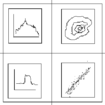
Figure 12:
A schematic view of a possible First Look window. Clockwise from
the upper left are shown a spectrum, an
image, housekeeping data (such as a voltage as a
function of time), and a light curve. These windows are configurable
by the User.
The User Interface to the AXAF Data Analysis Software is designed so that the user can put minimal effort into simple tasks (for example the Observation Browser and the First Look software) and yet it is sophisticated enough for the user to perform the complex final analysis required by AXAF data (the Data Visualizer). It will take AXAF Users' into the 21st century!
Andrea Prestwich